Animation - Adobe Illustrator - Intro to Motion Design
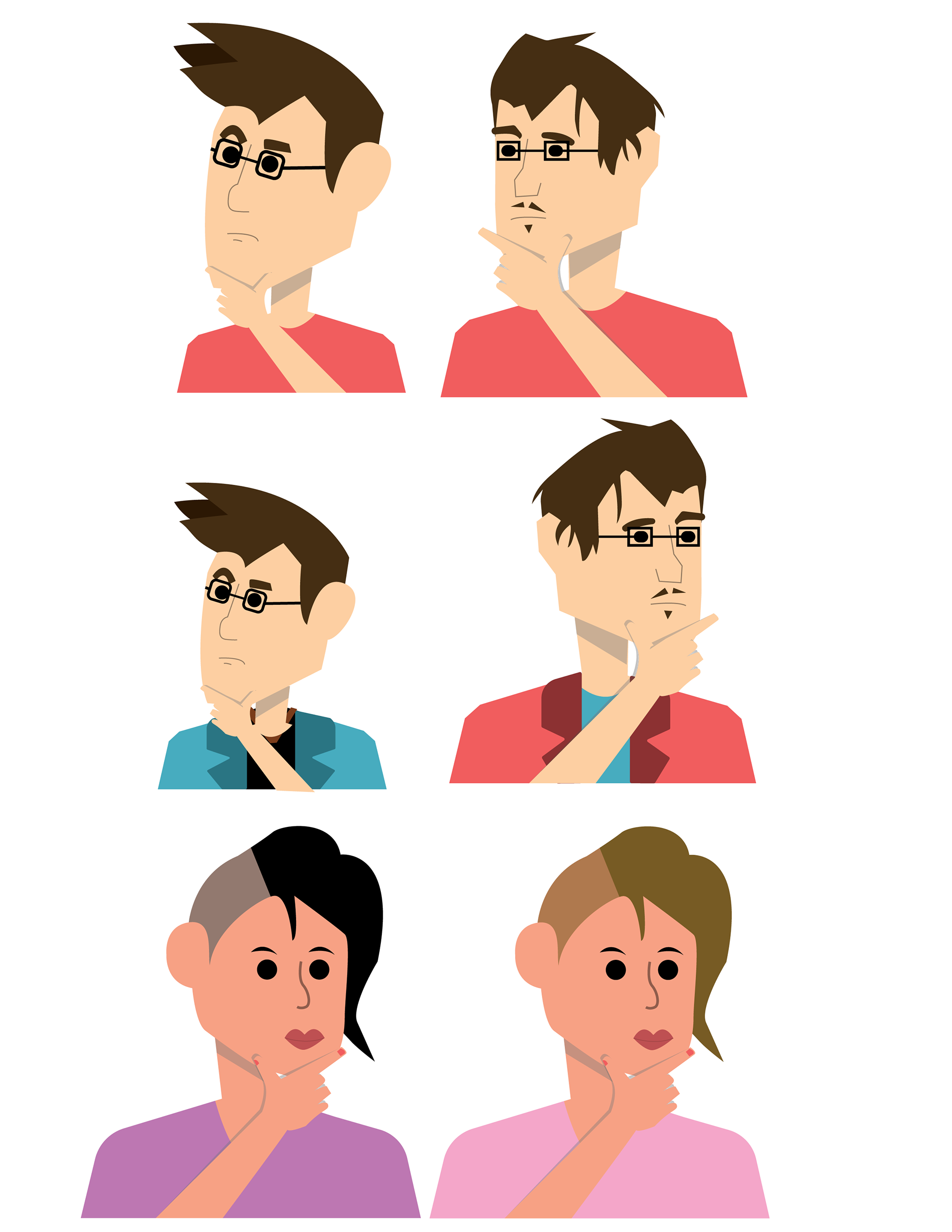
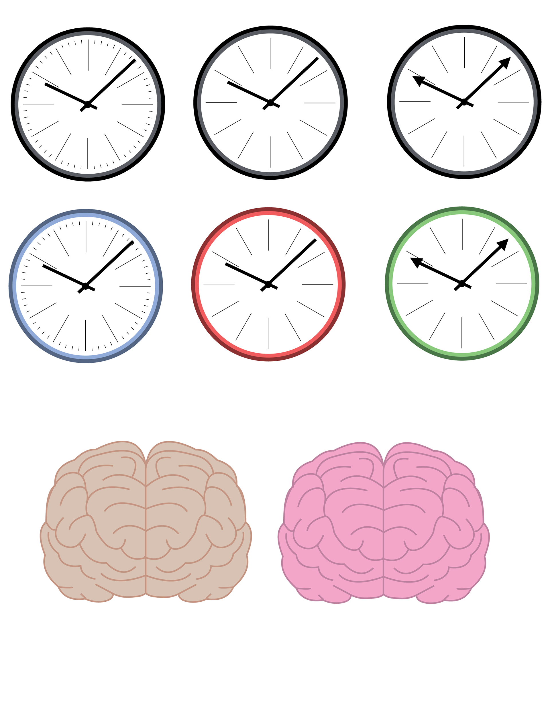
Style sheets
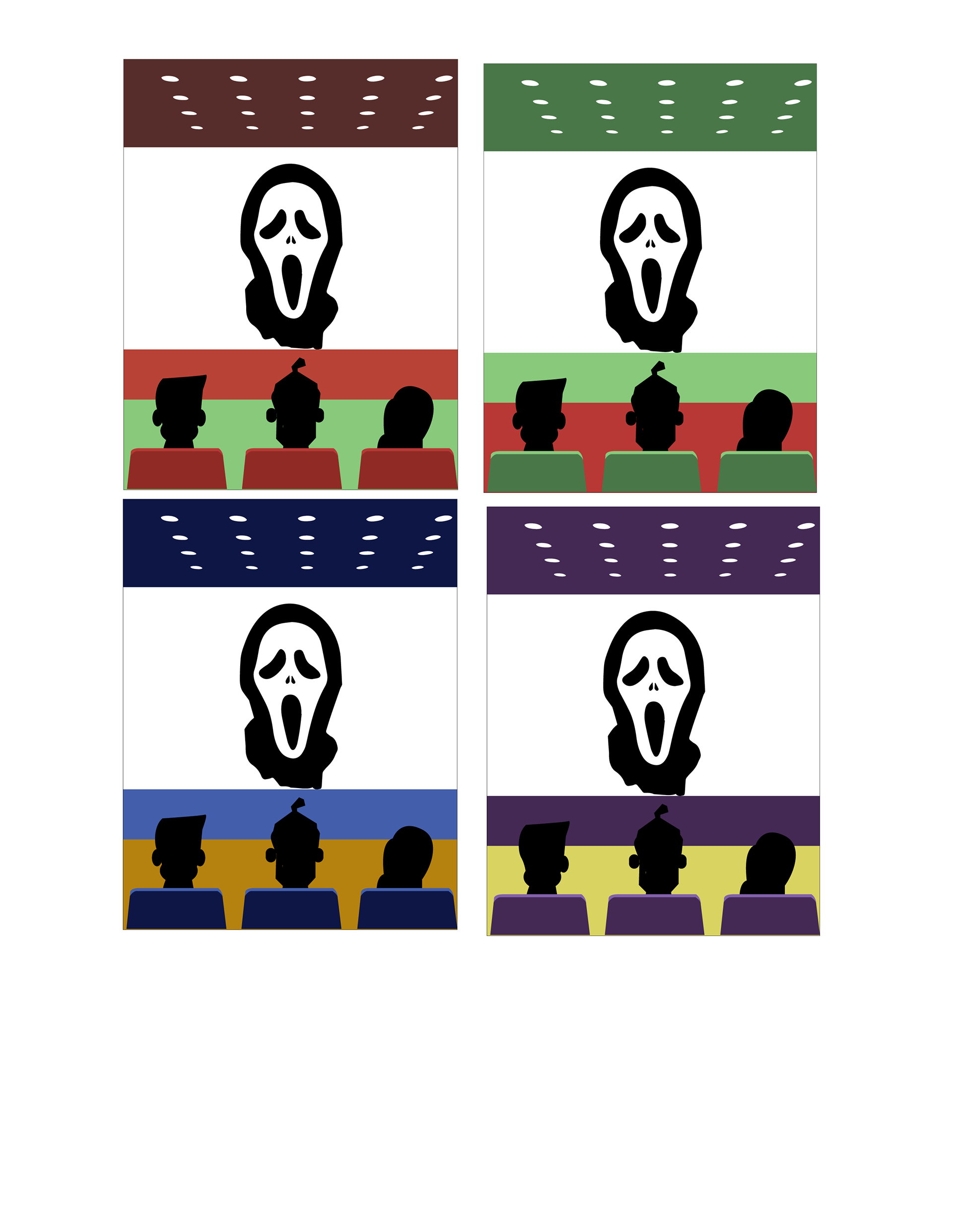
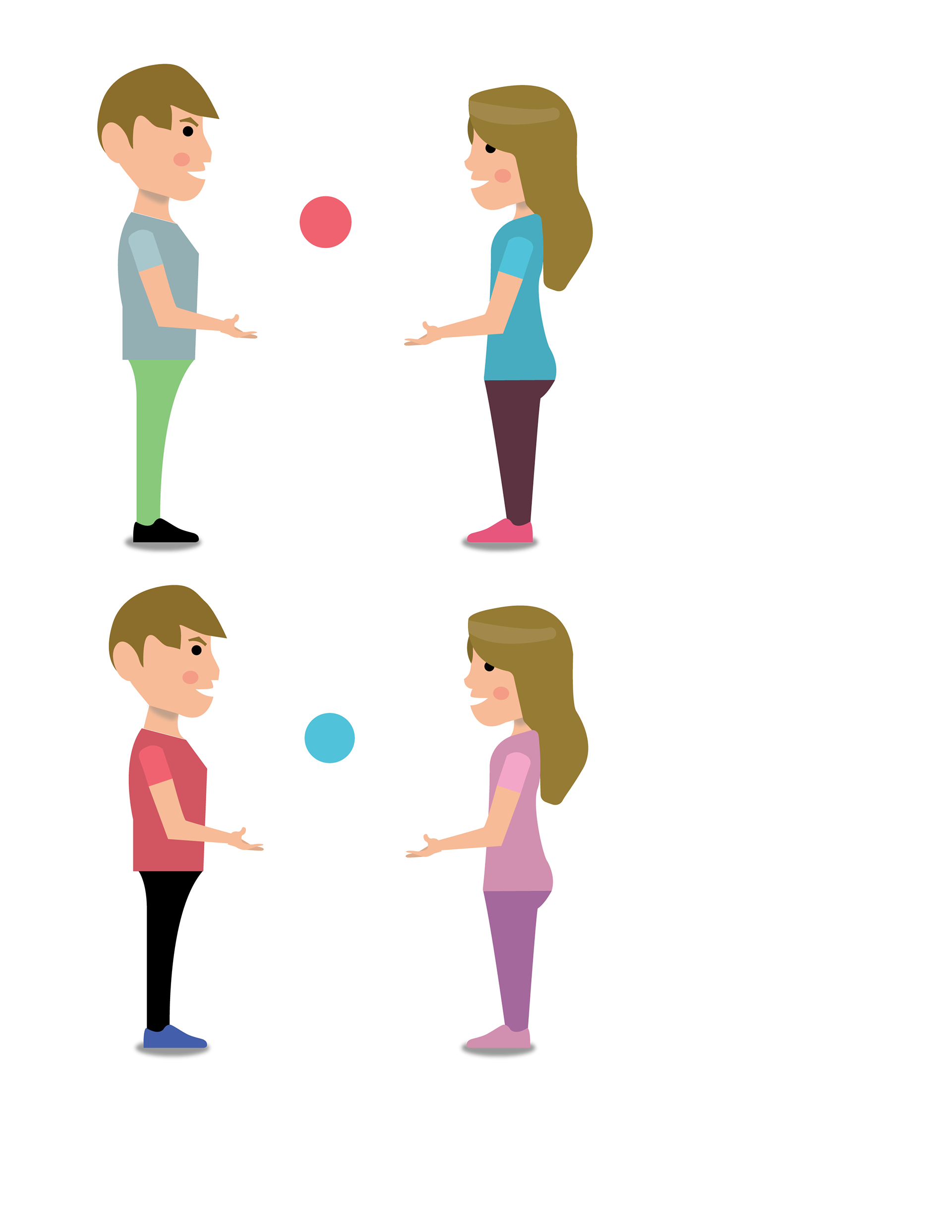
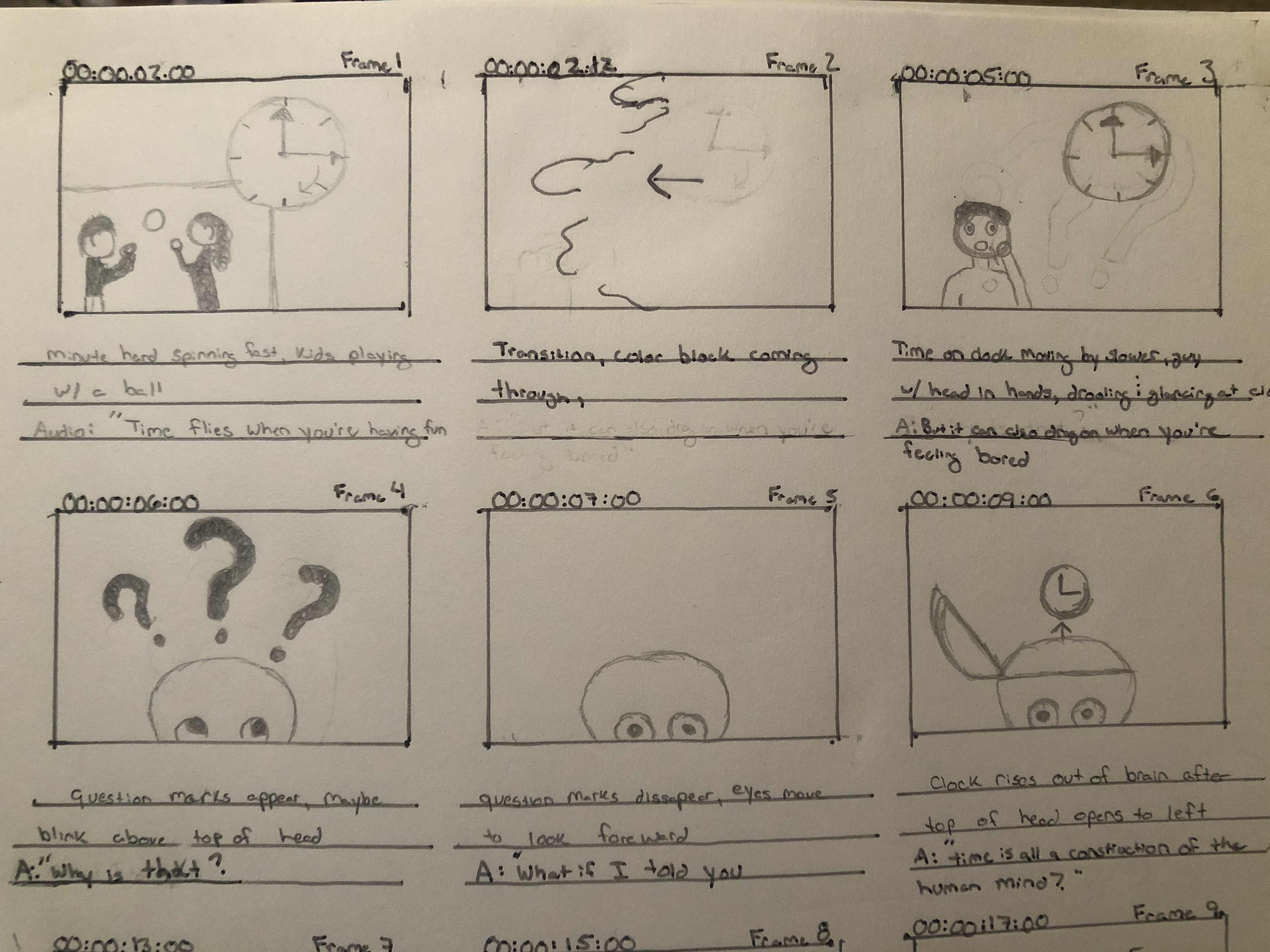
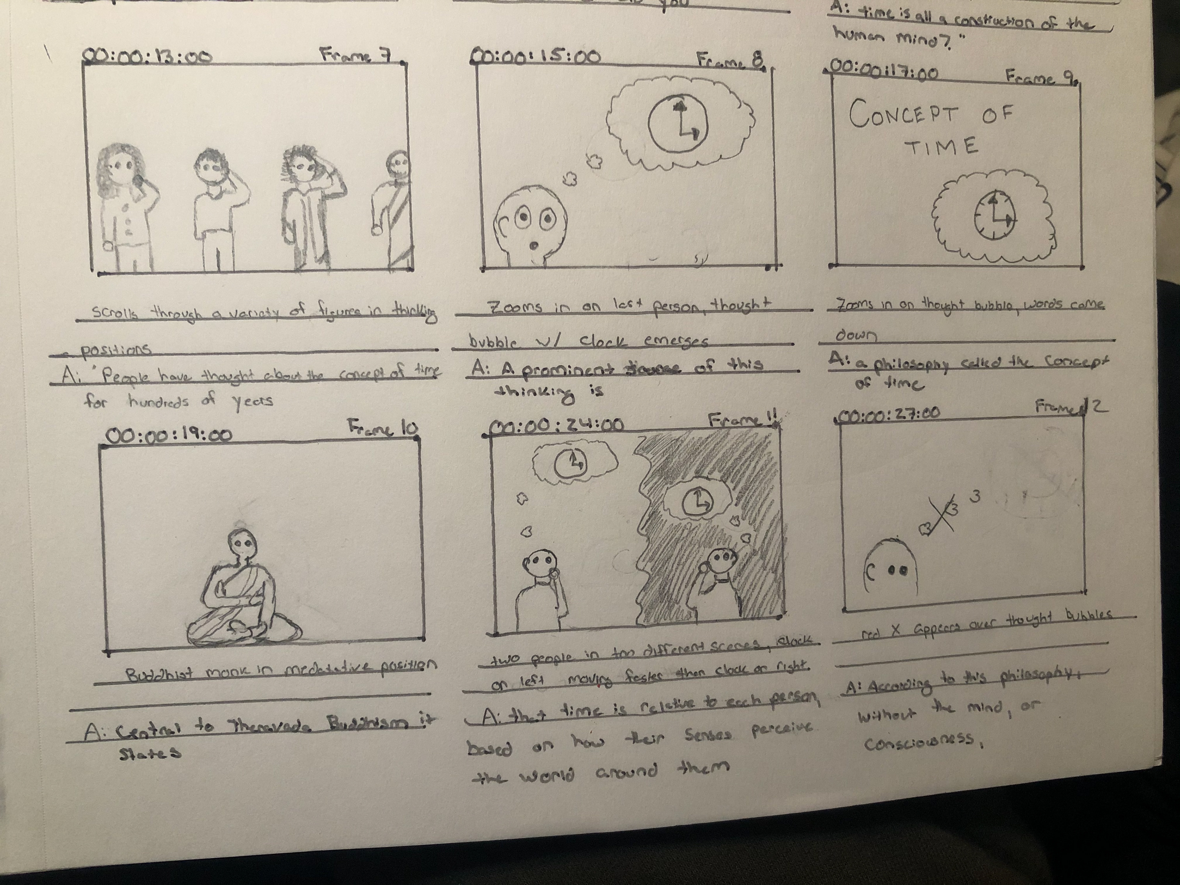
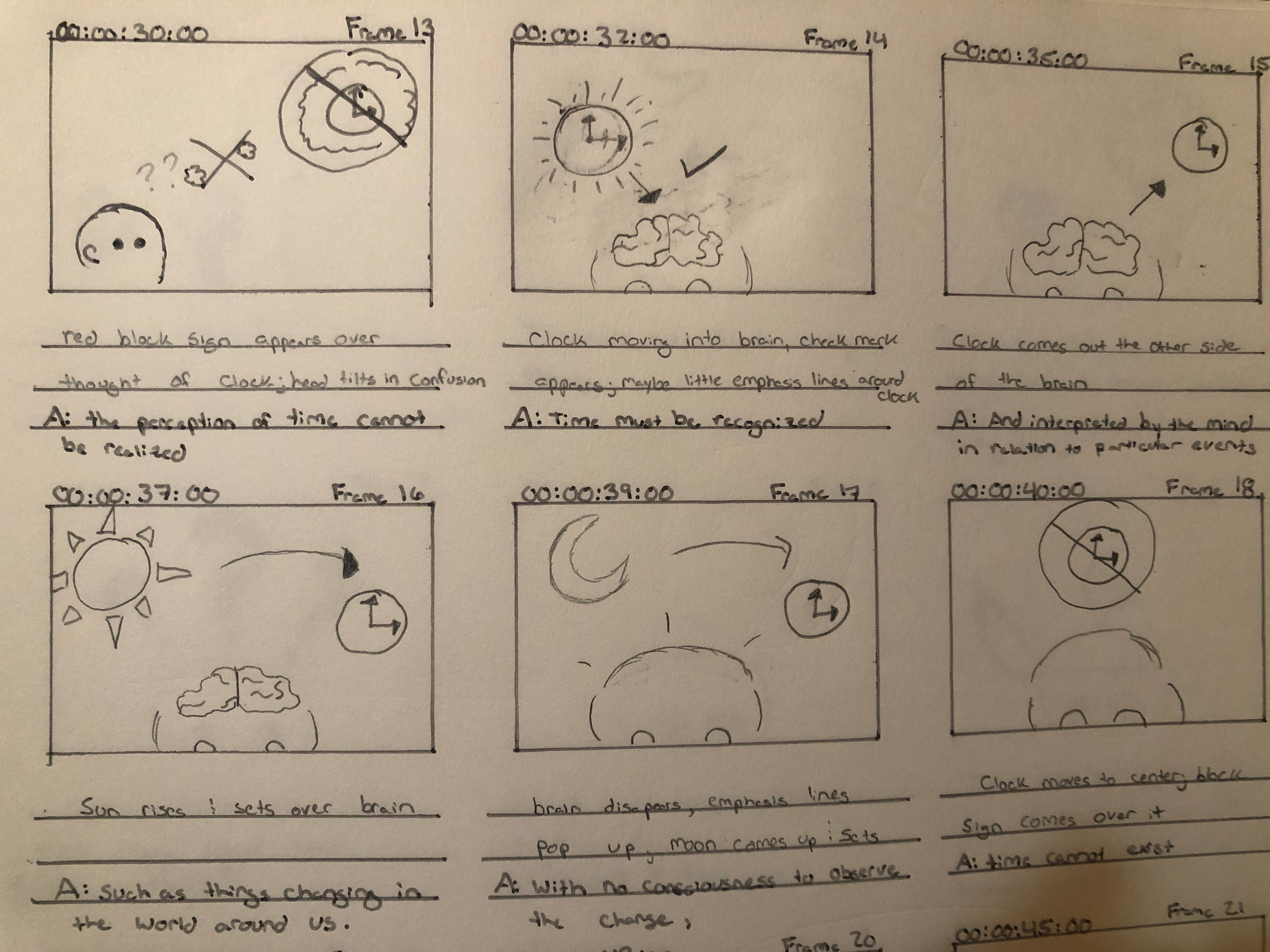
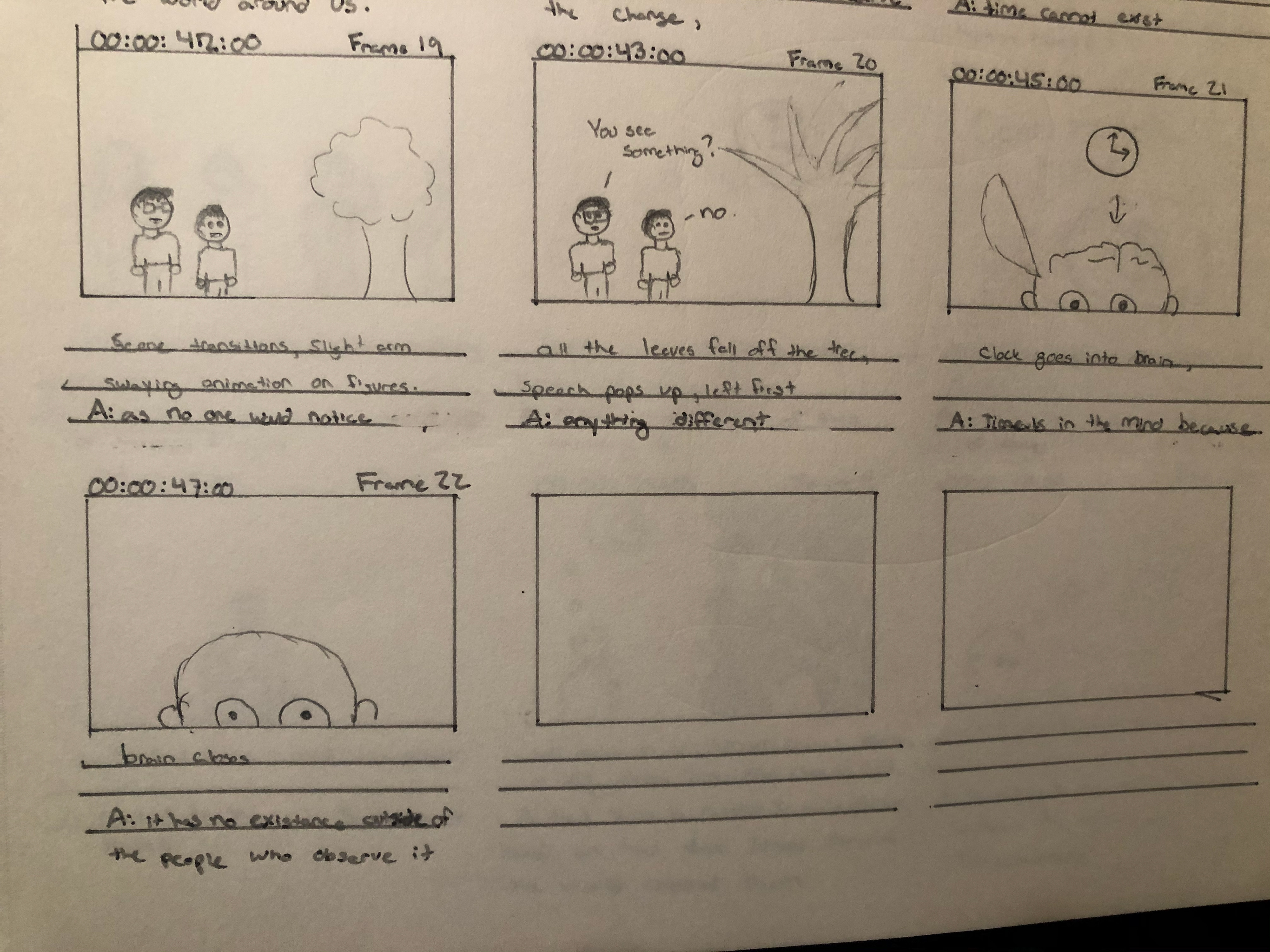
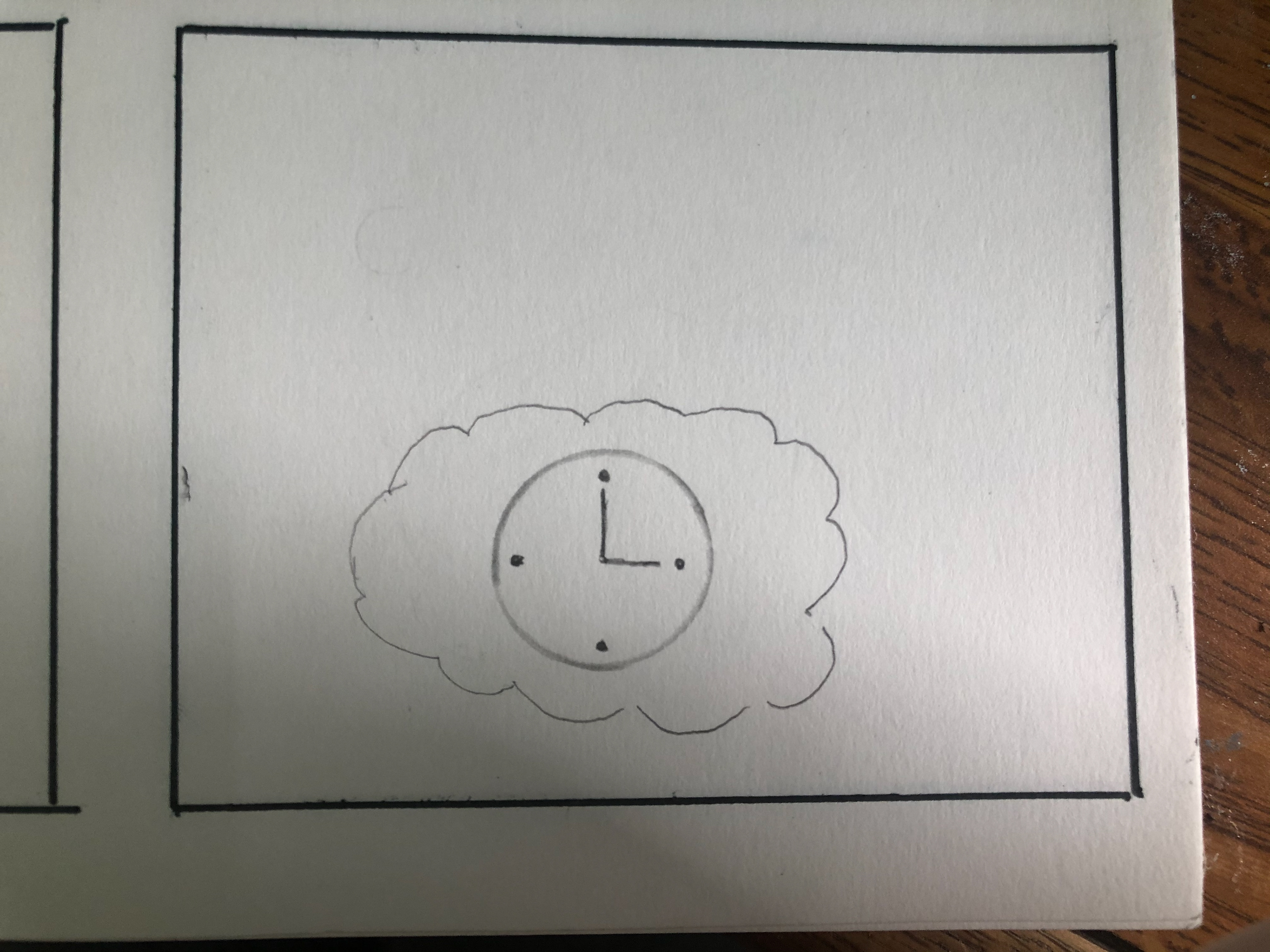
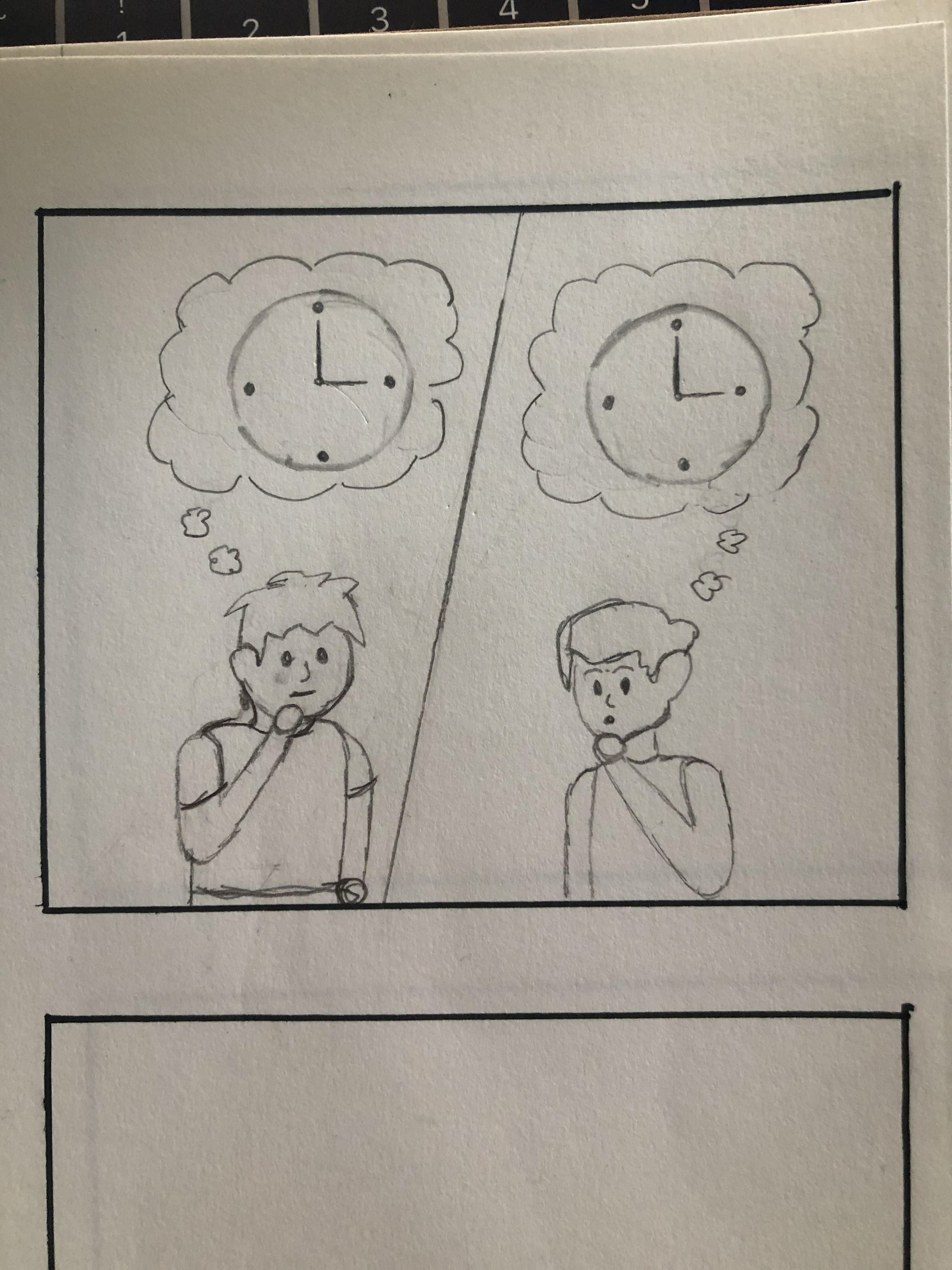
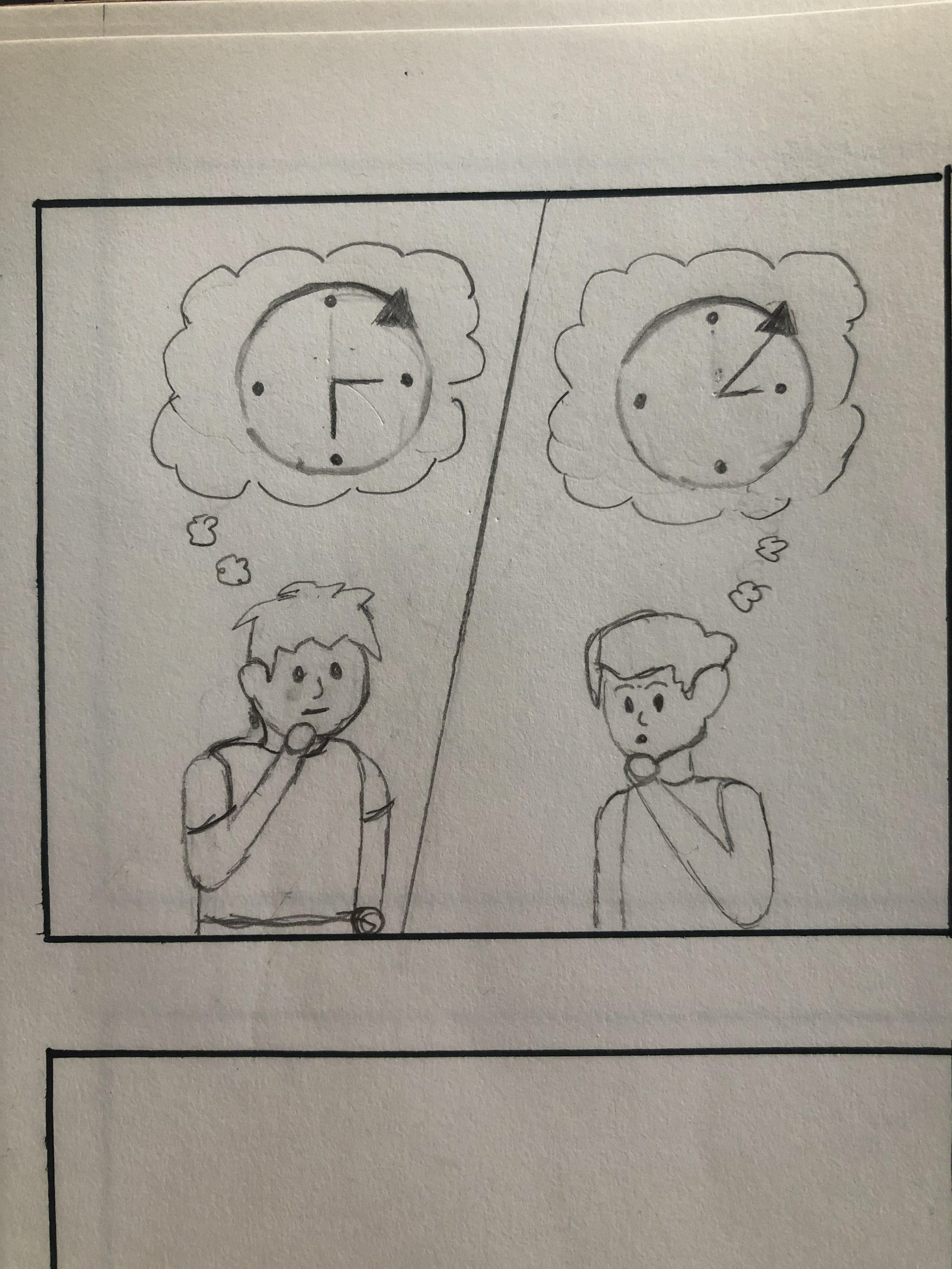
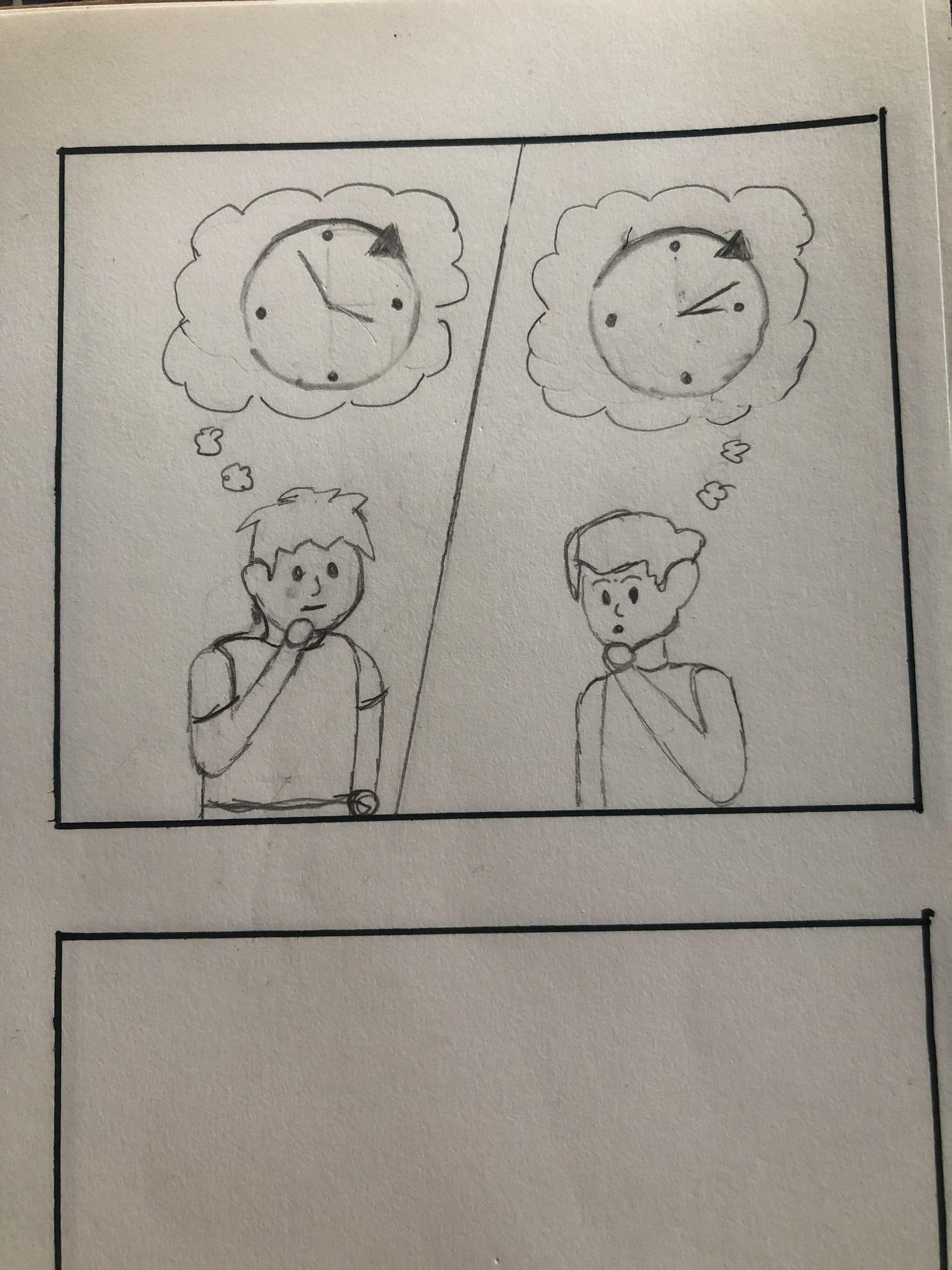
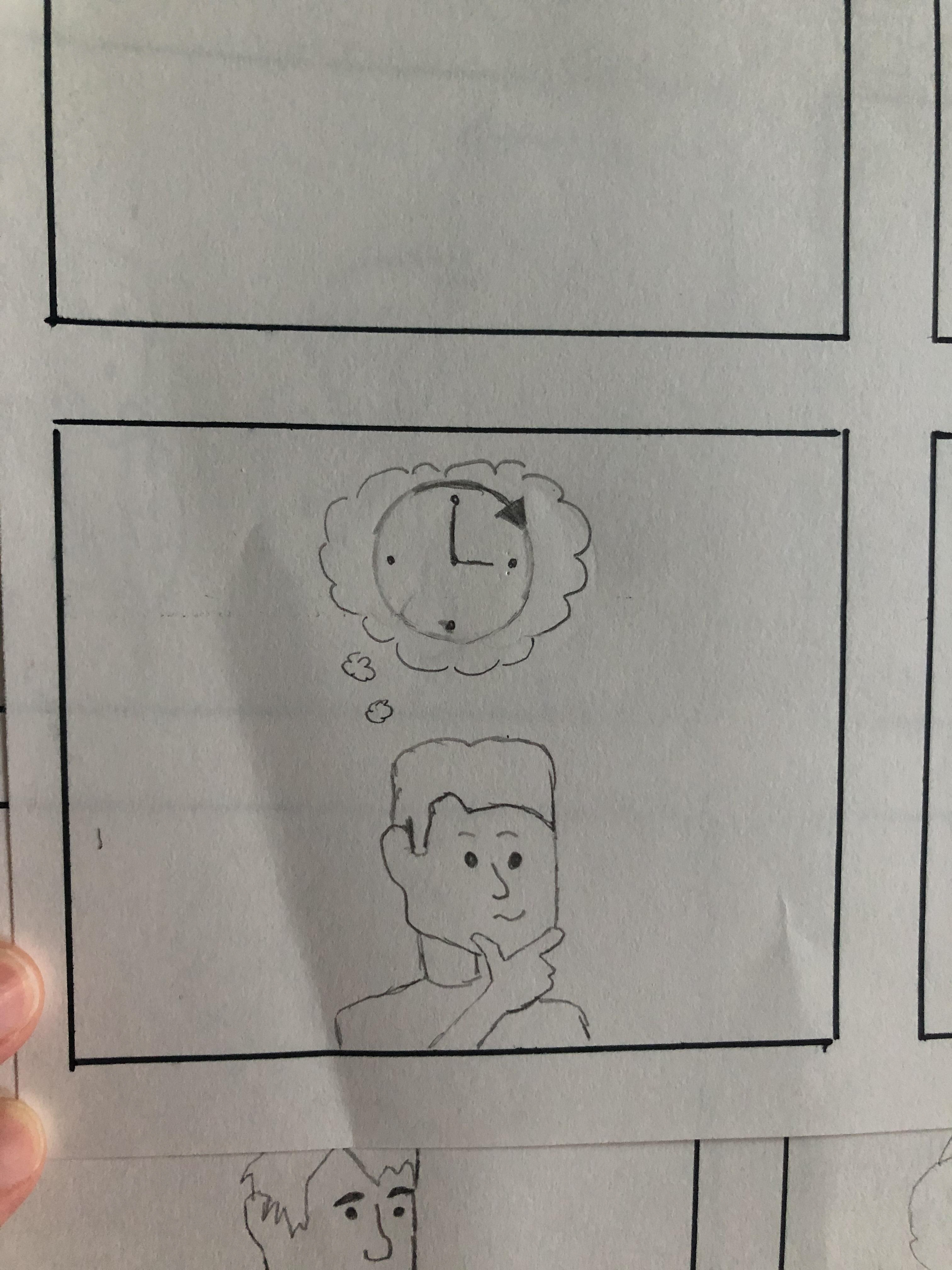
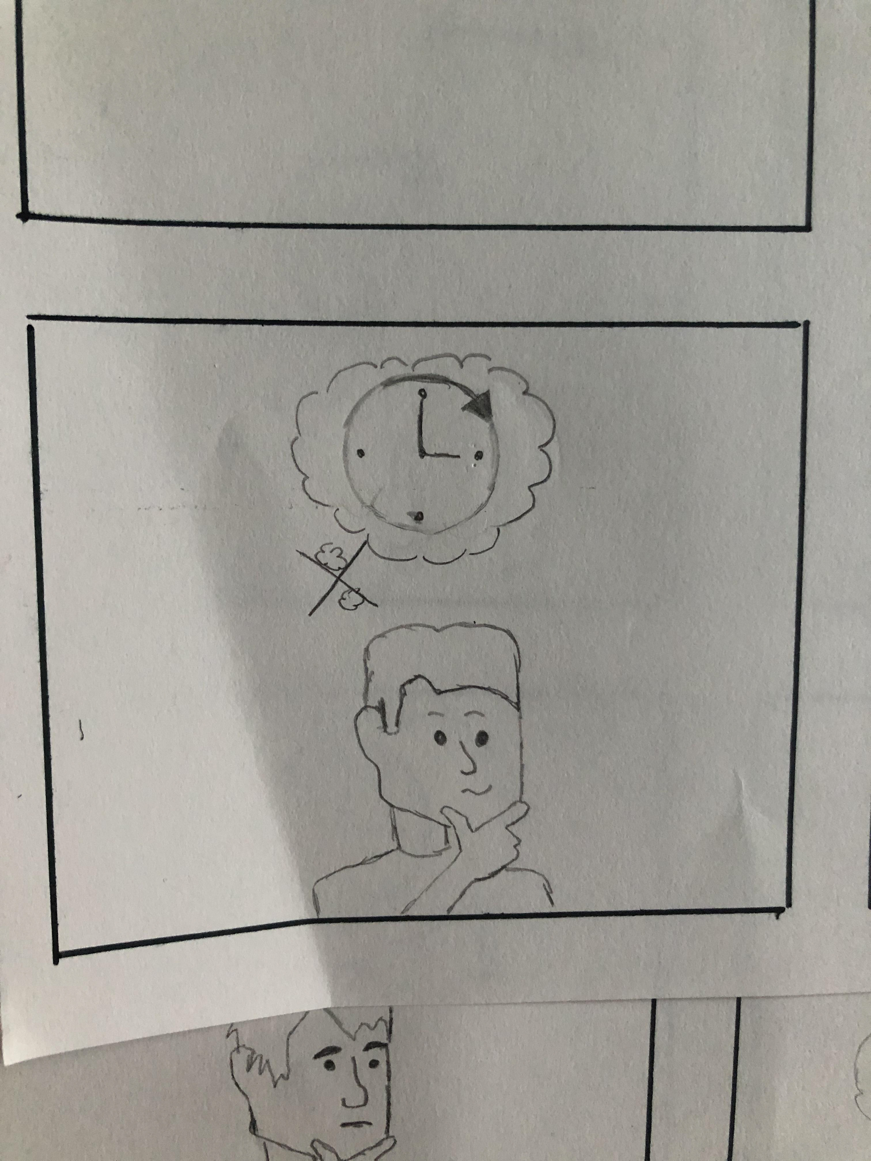
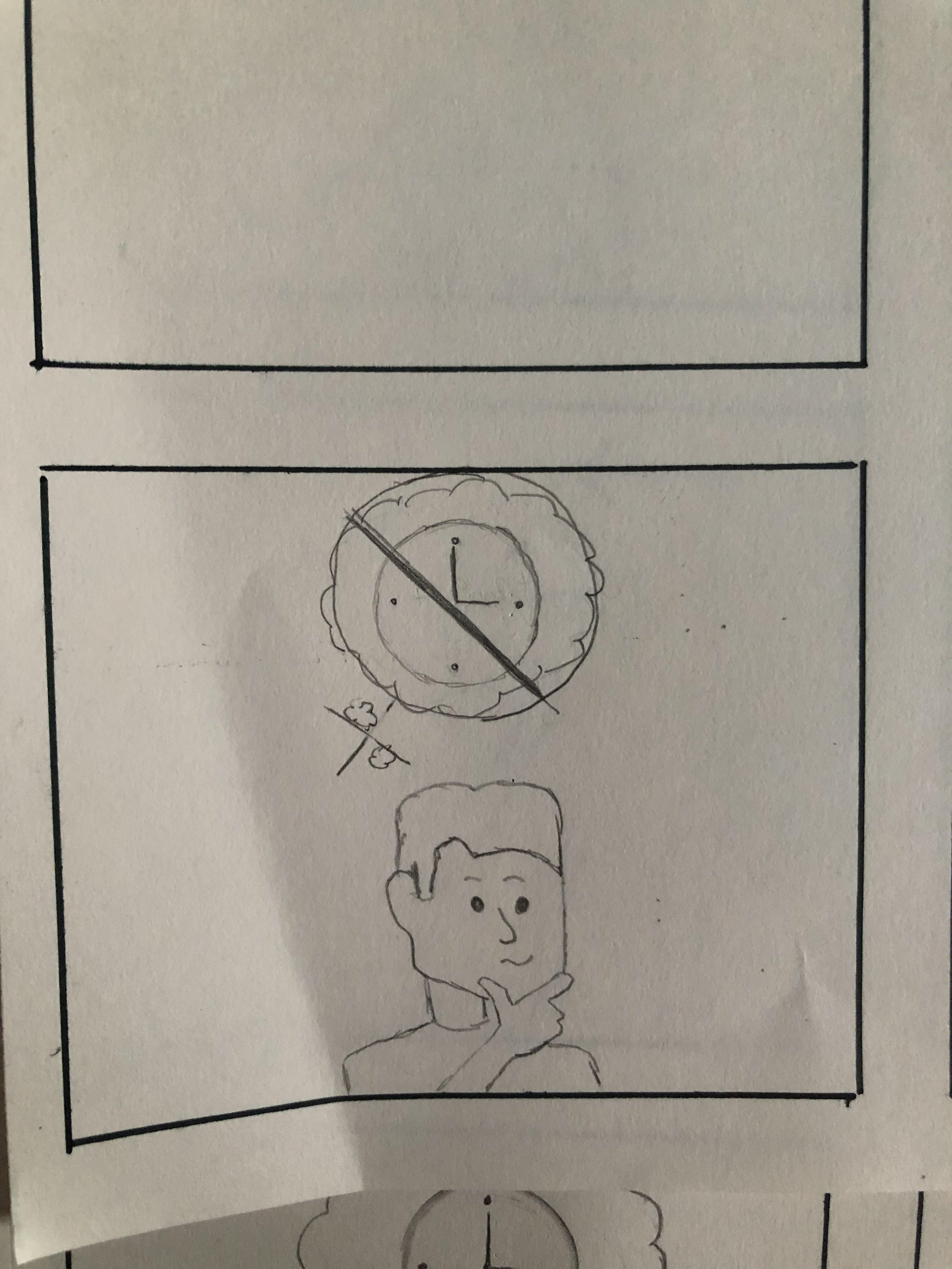
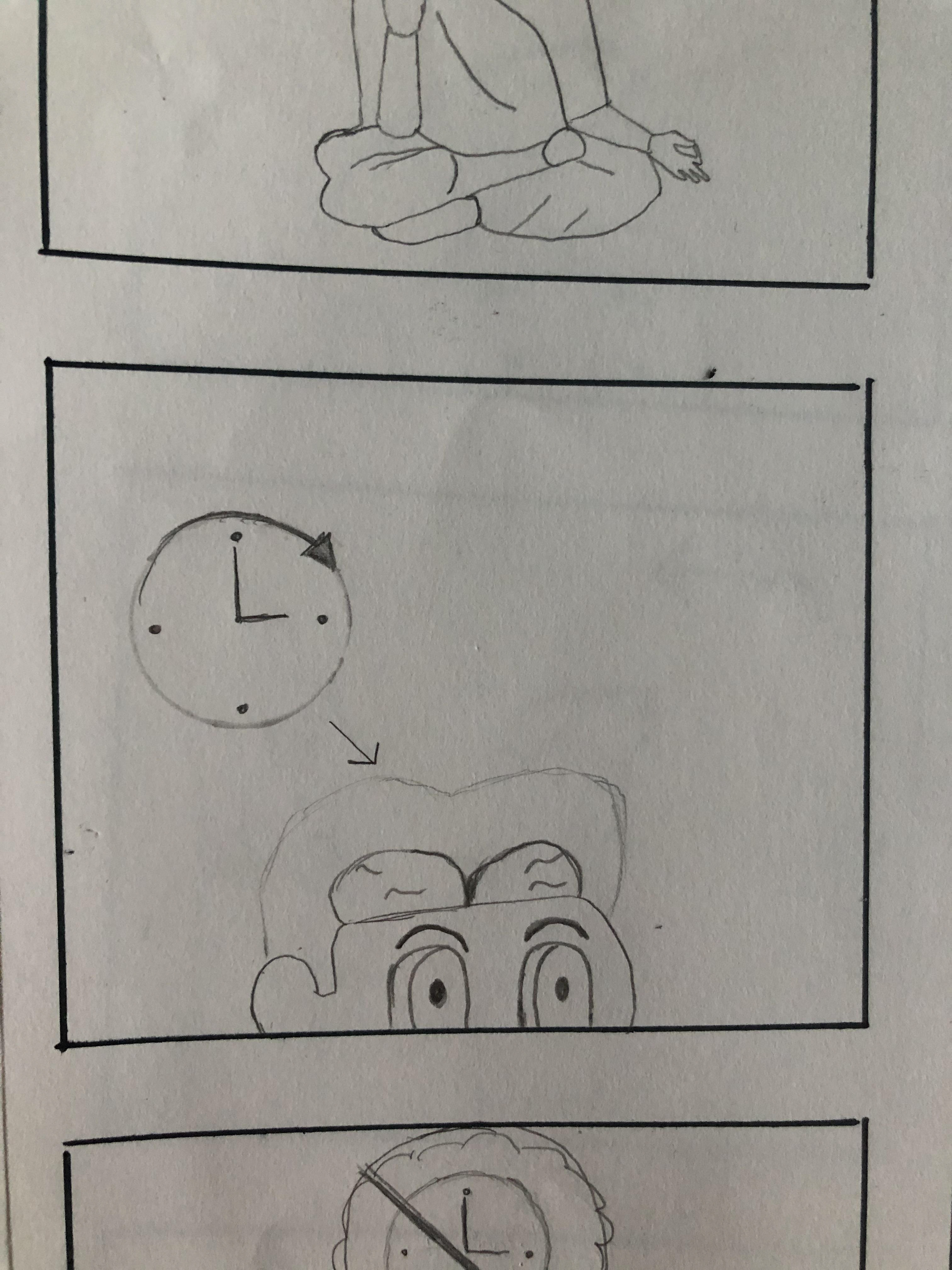
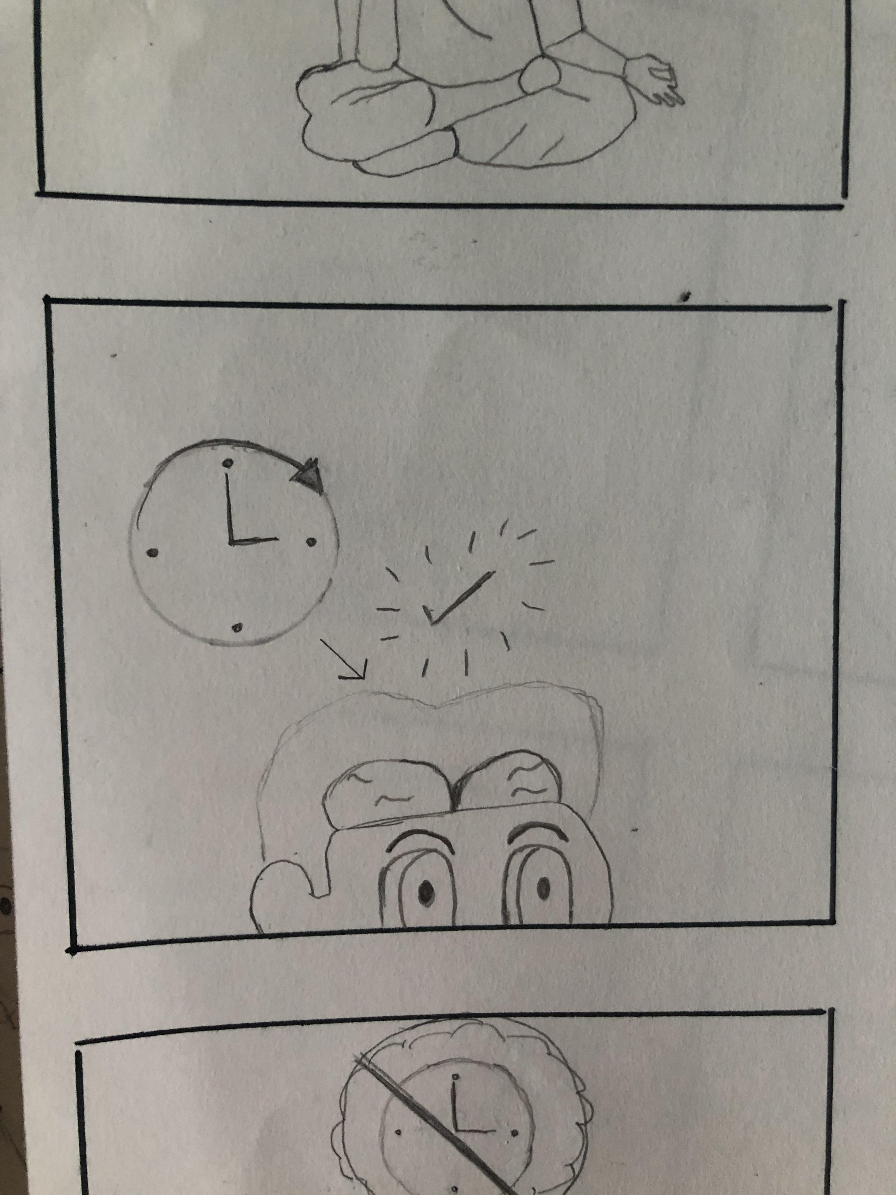
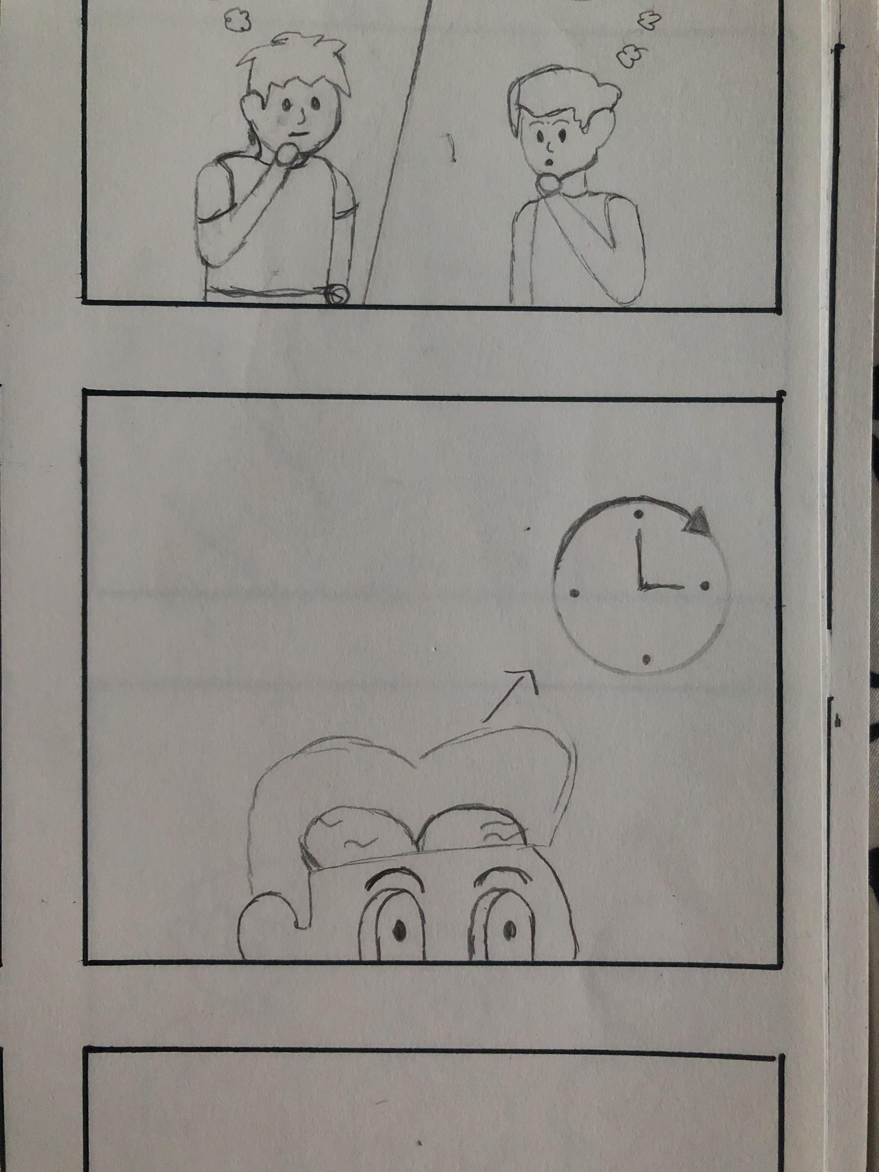
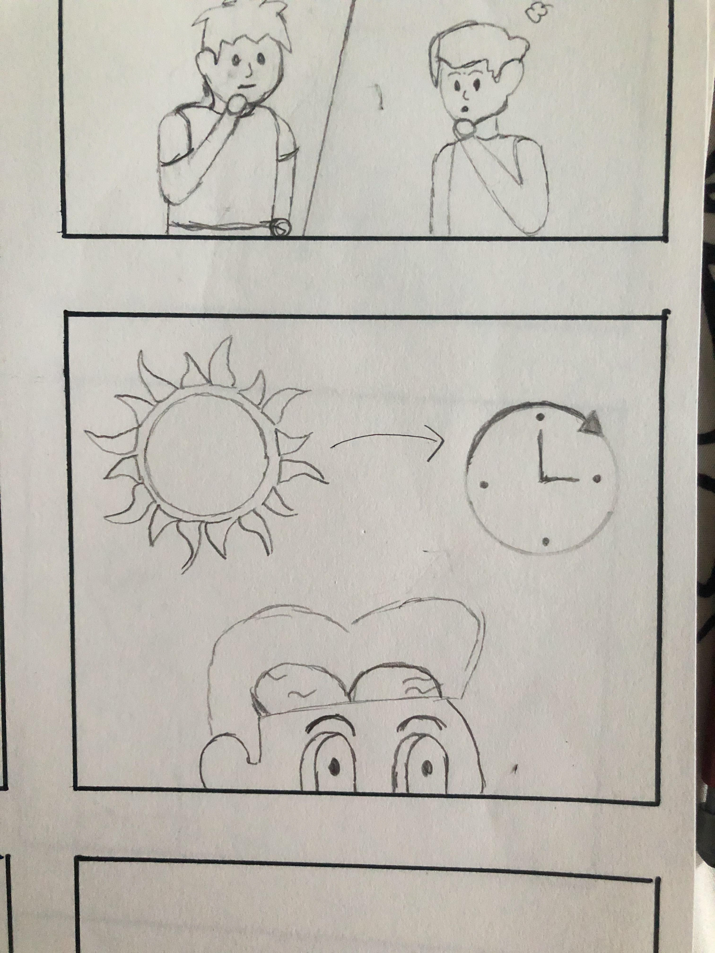
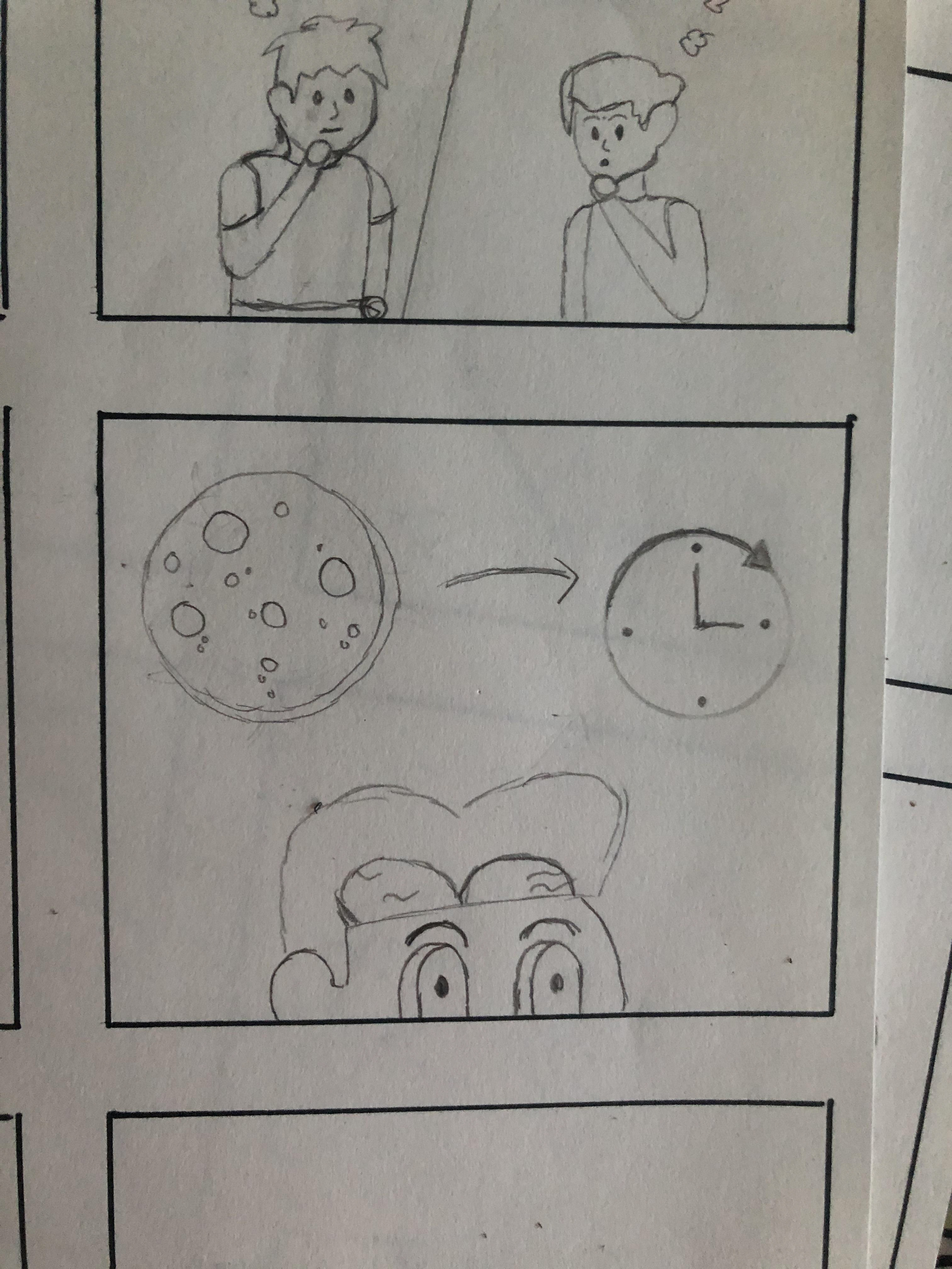
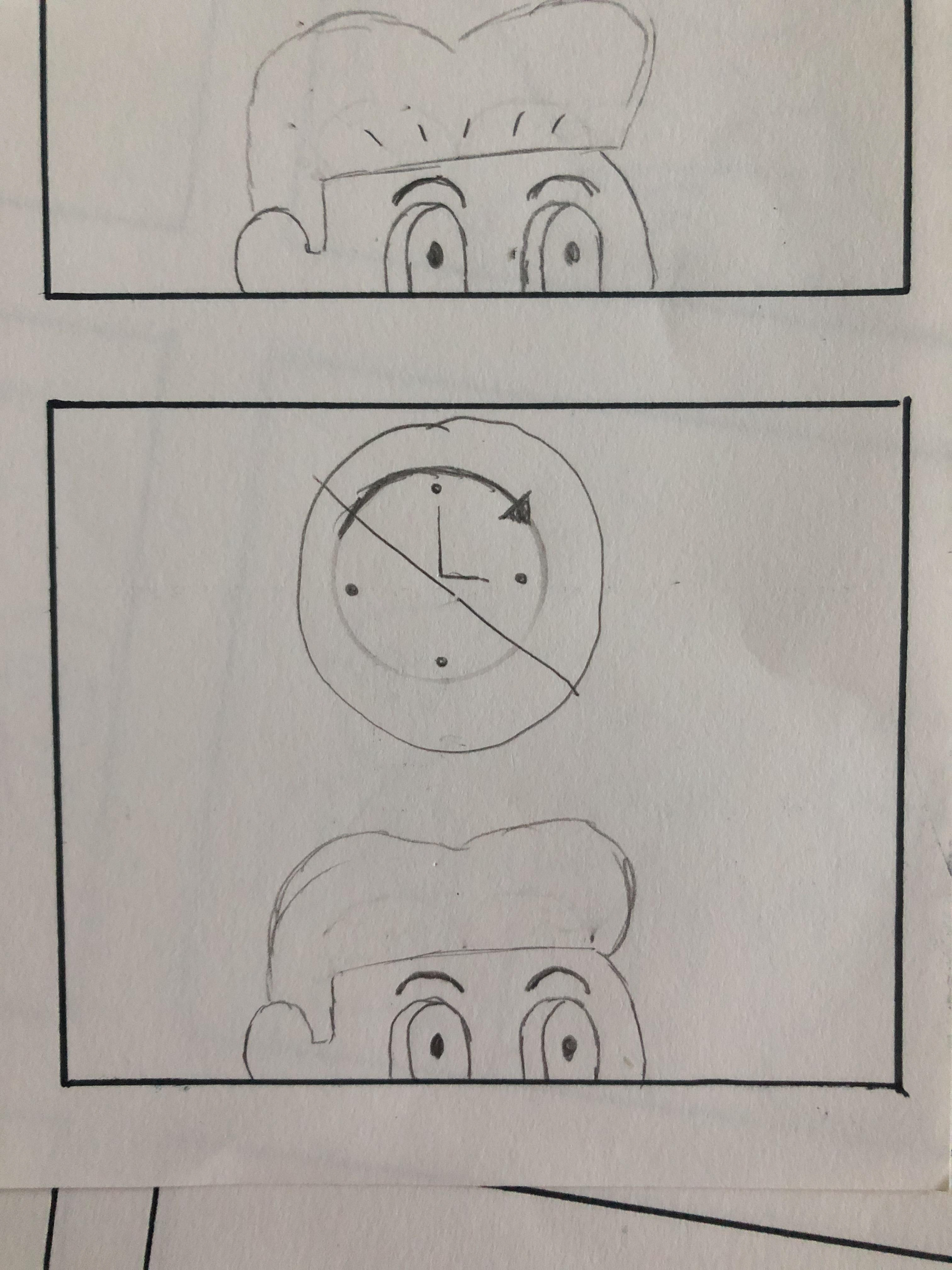
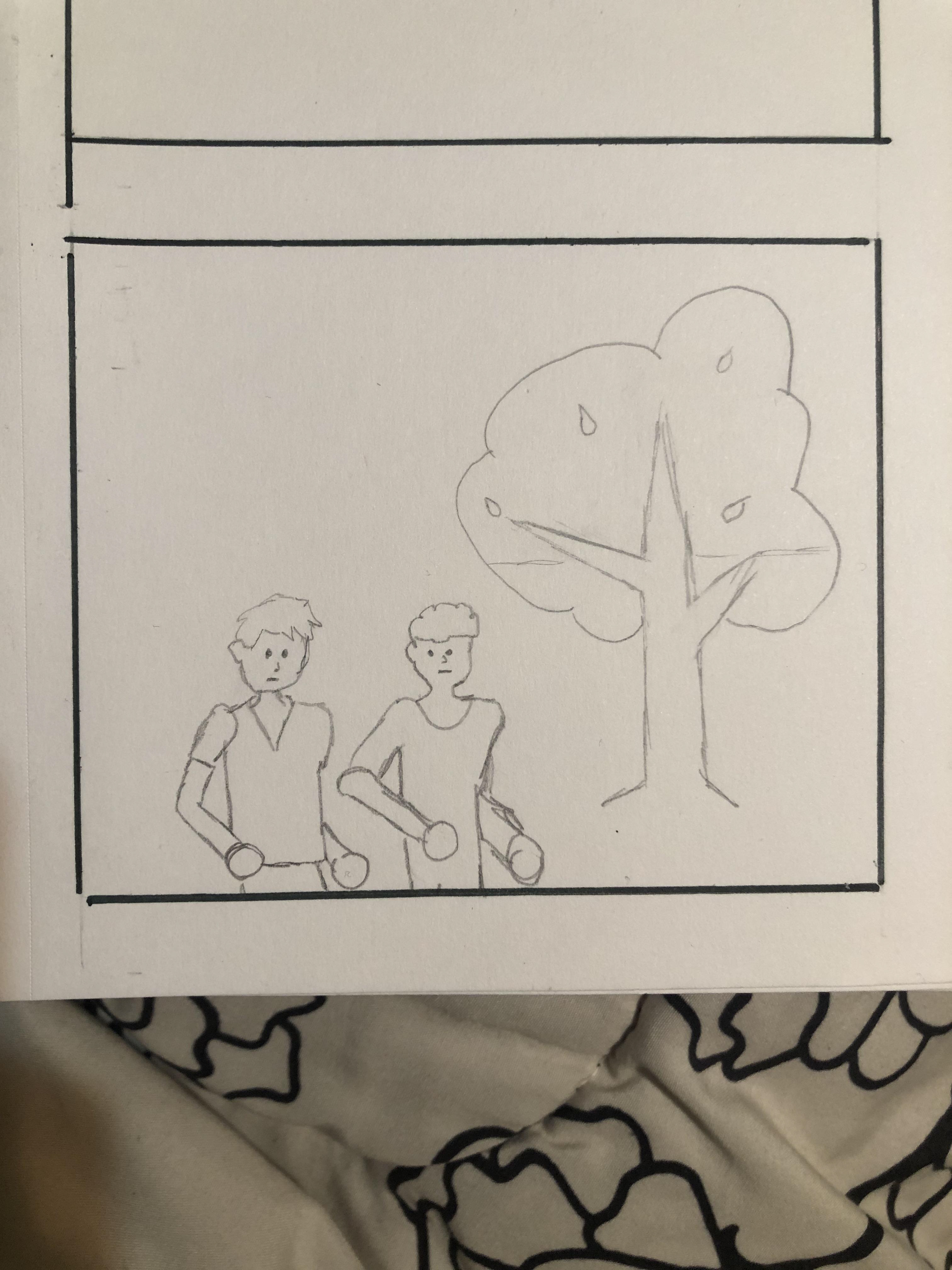
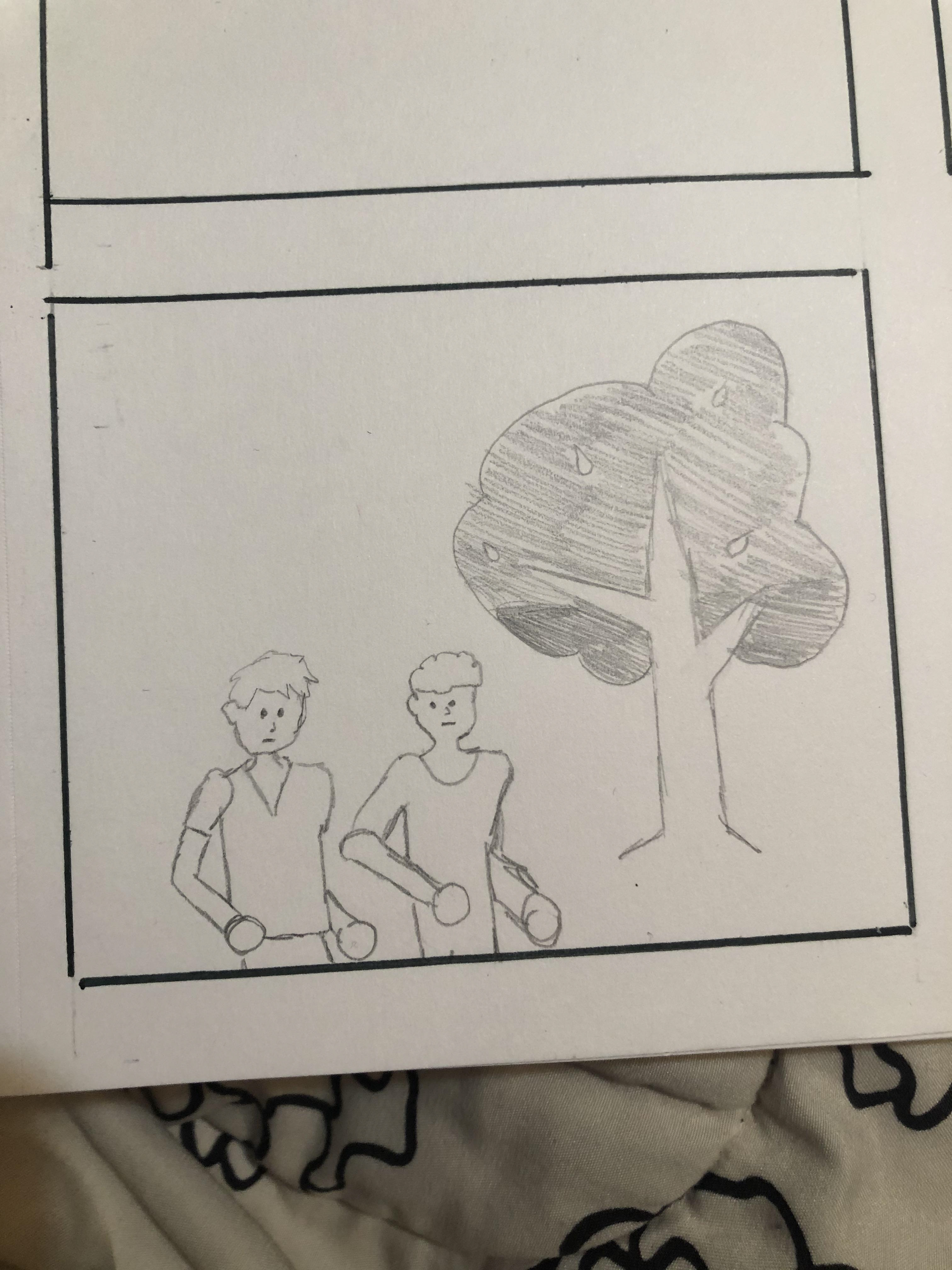
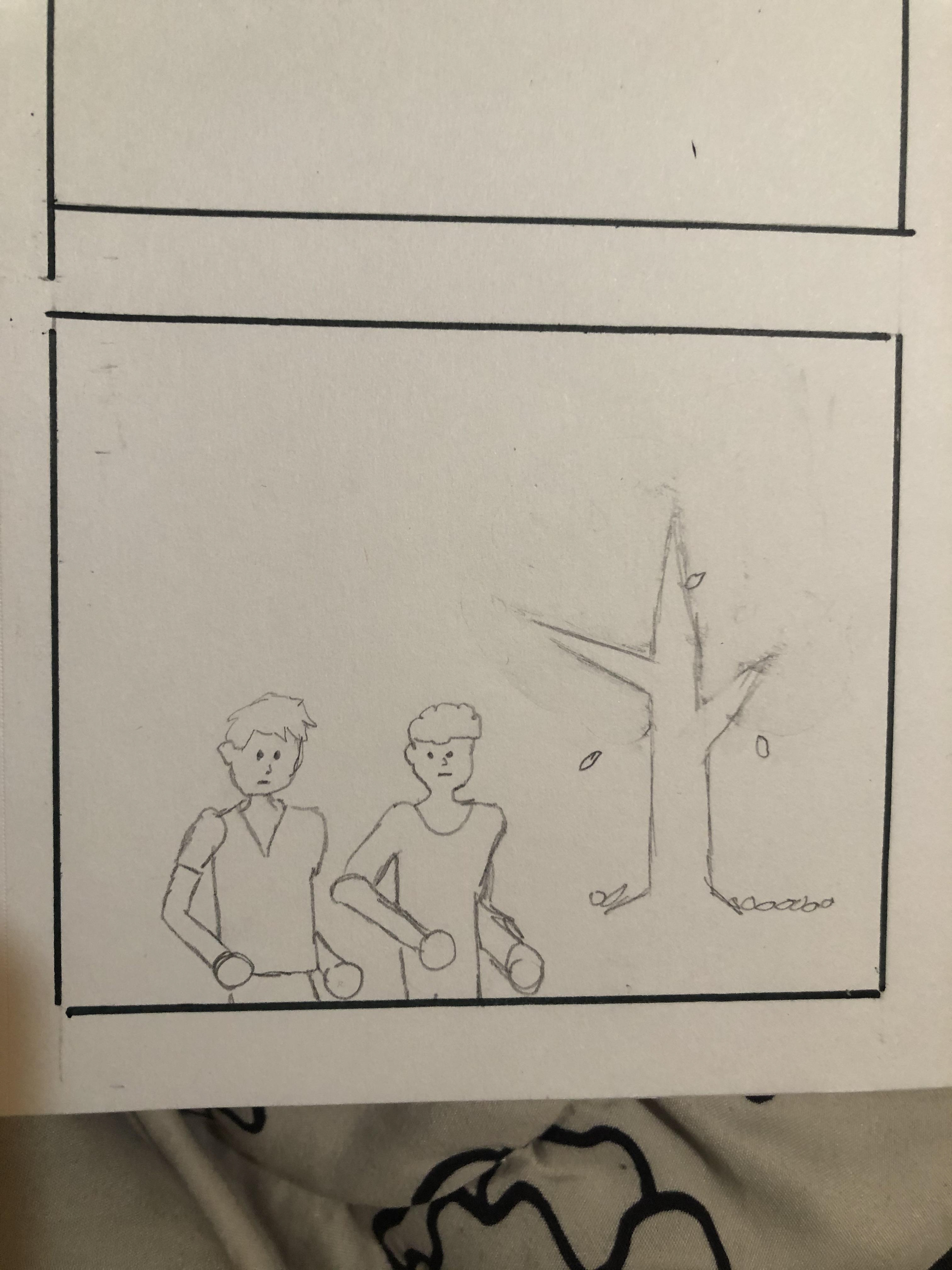
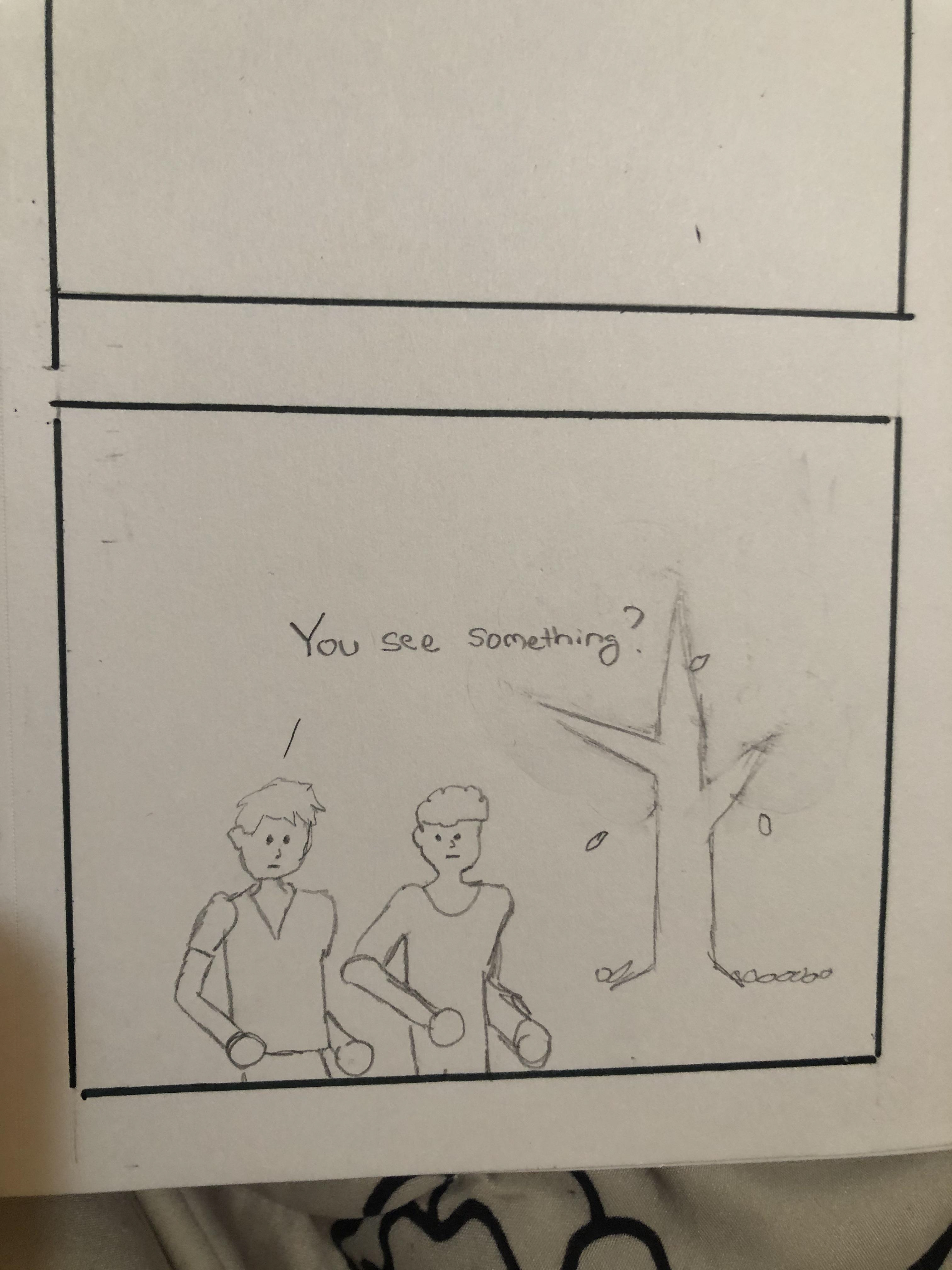
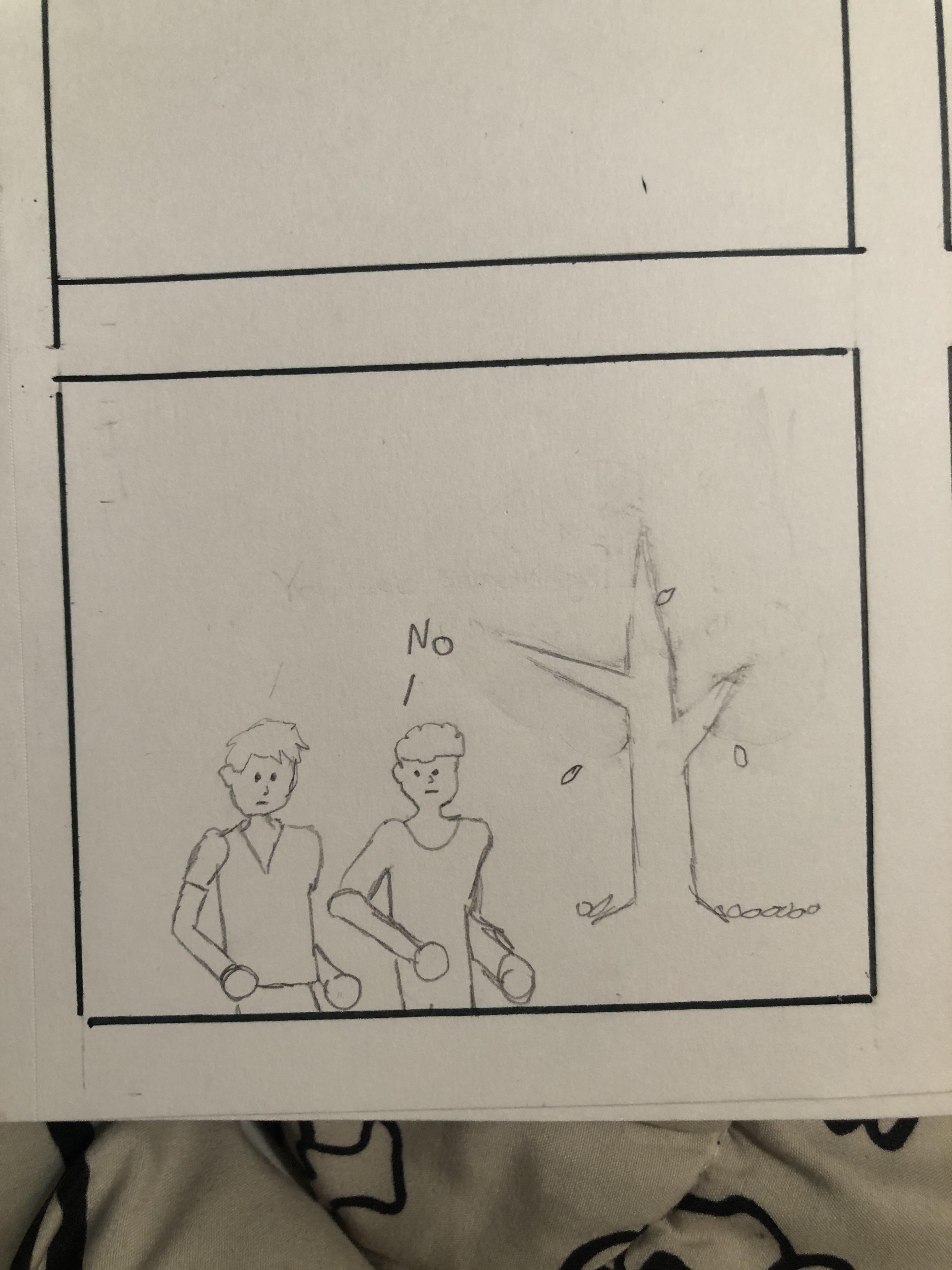
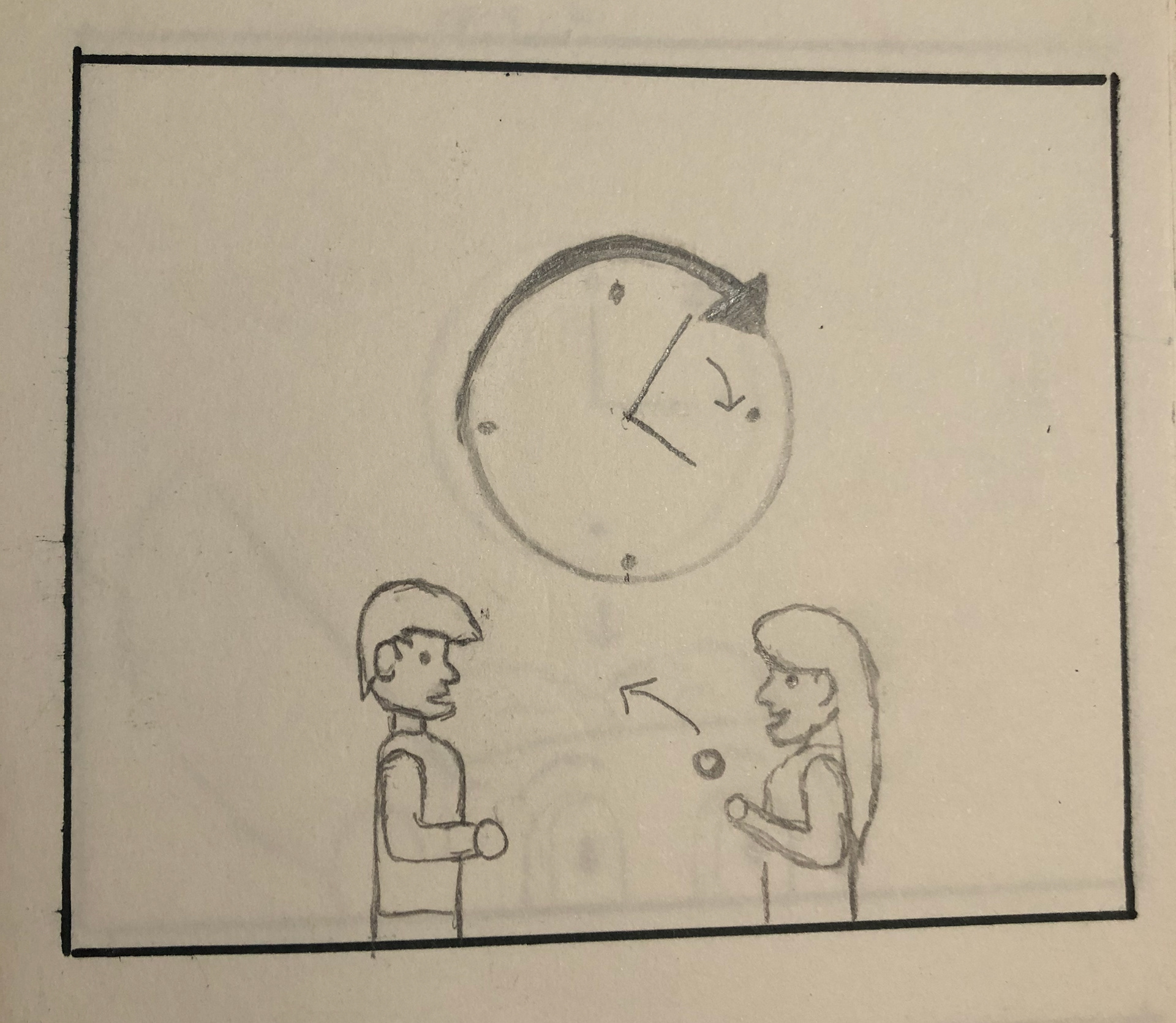
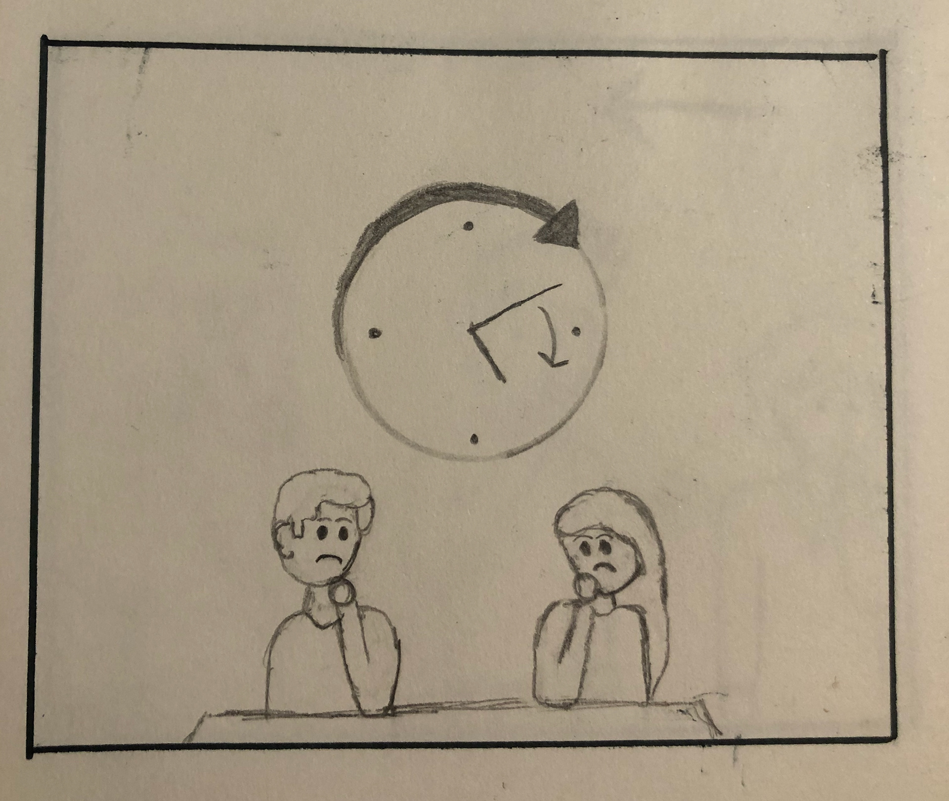
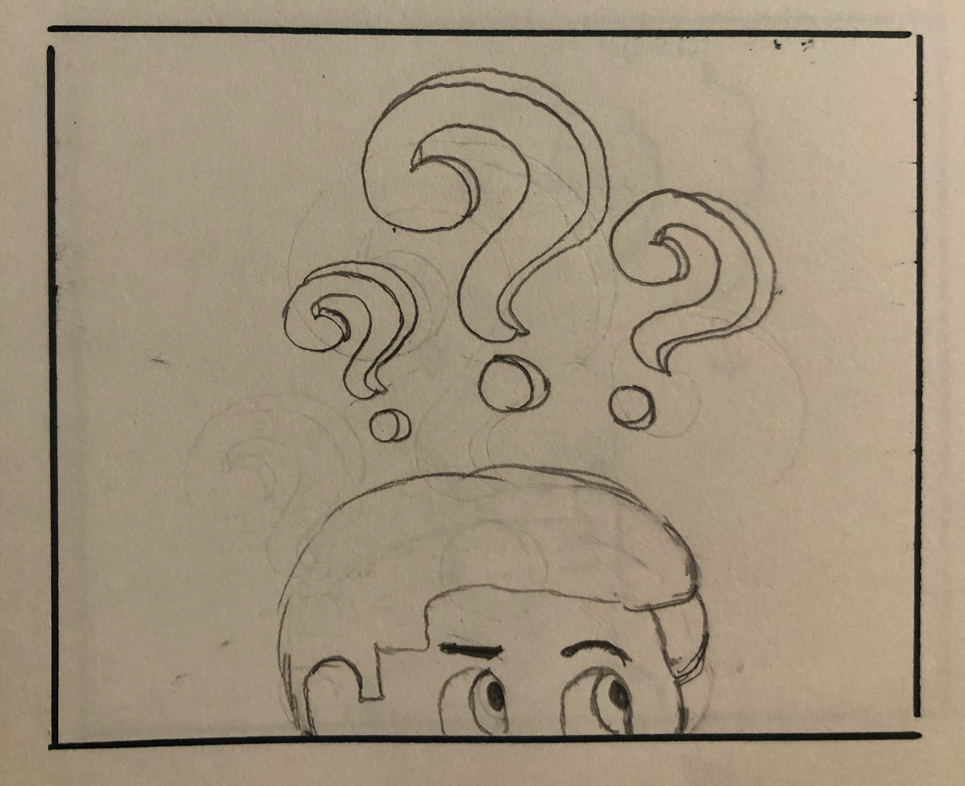
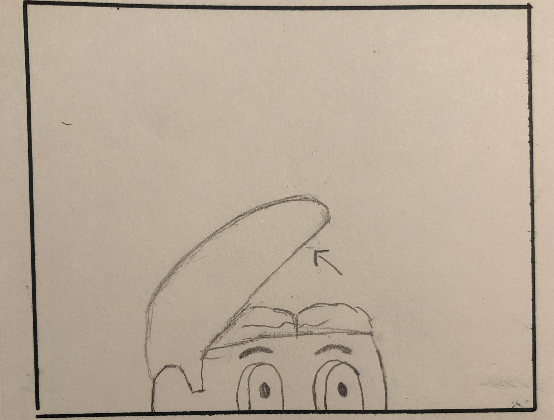
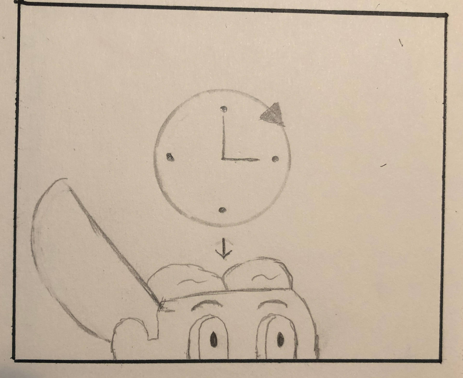
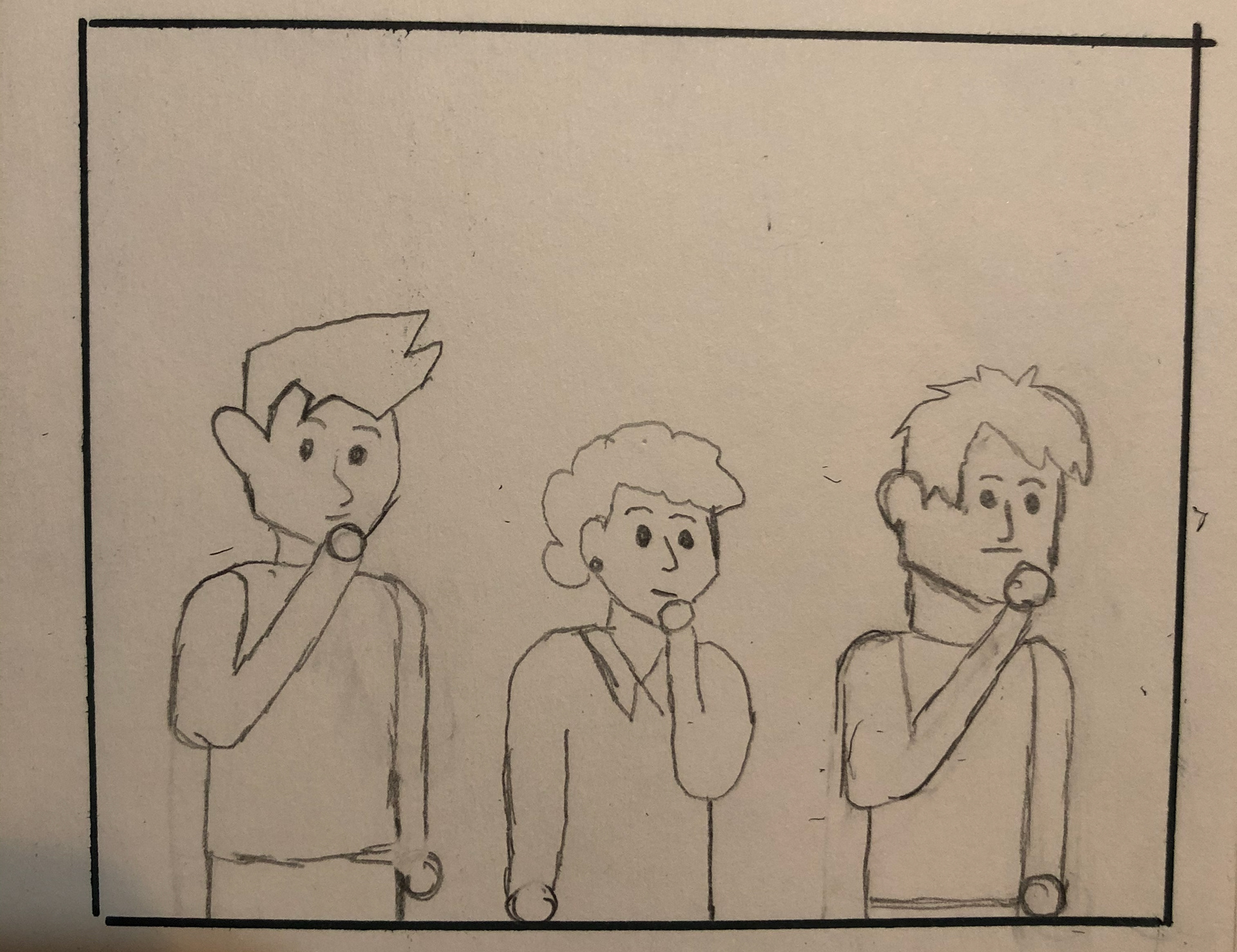
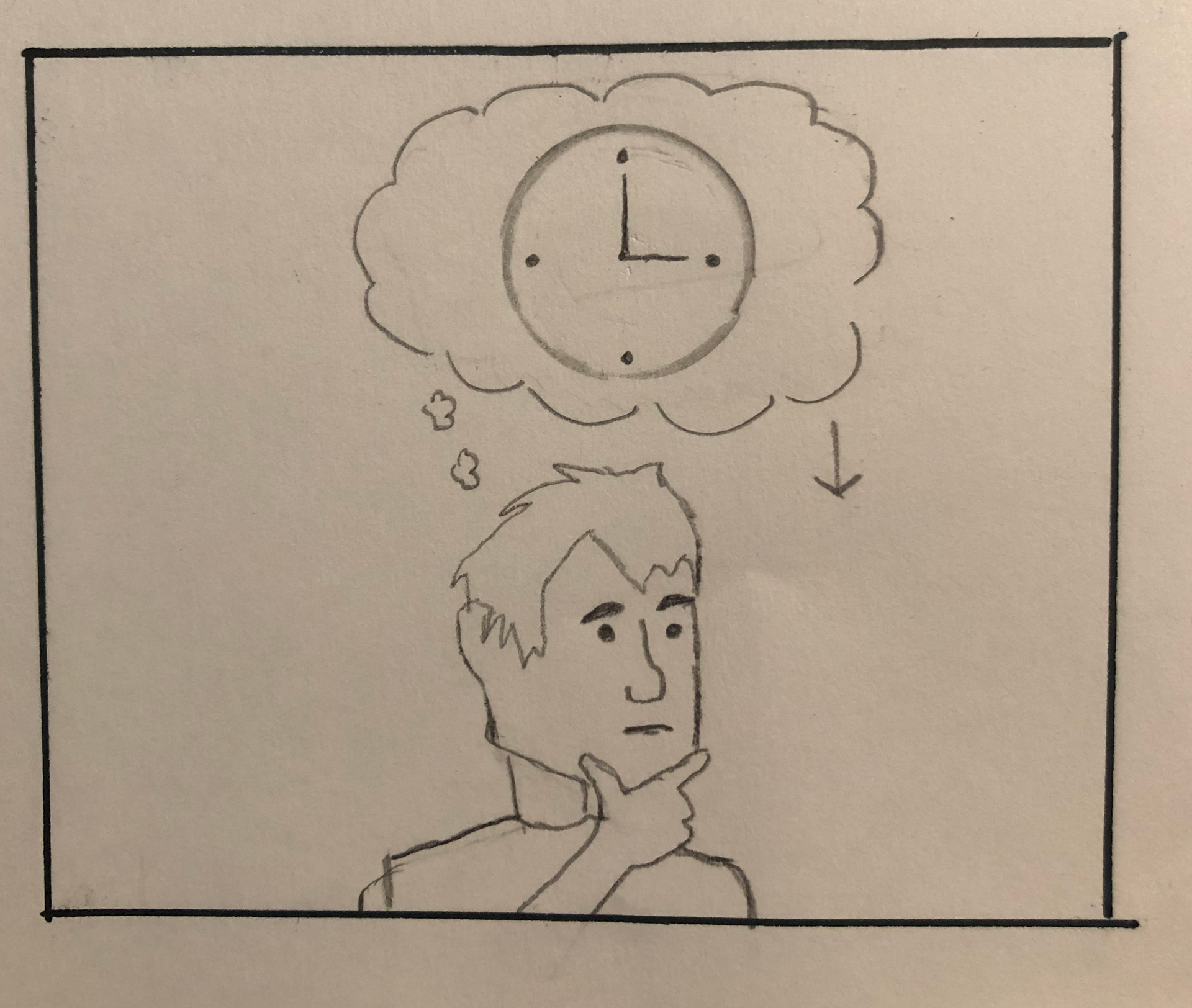
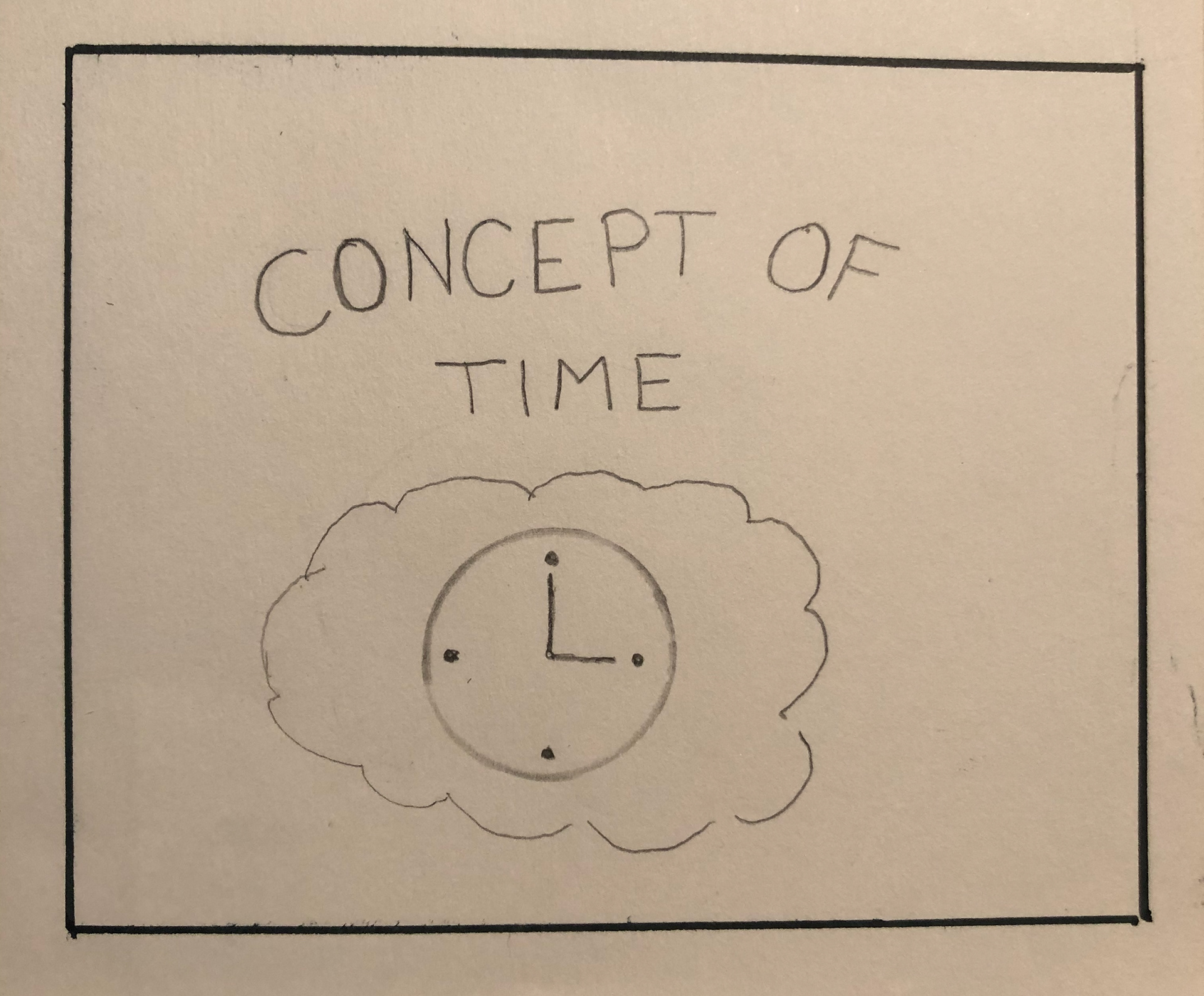
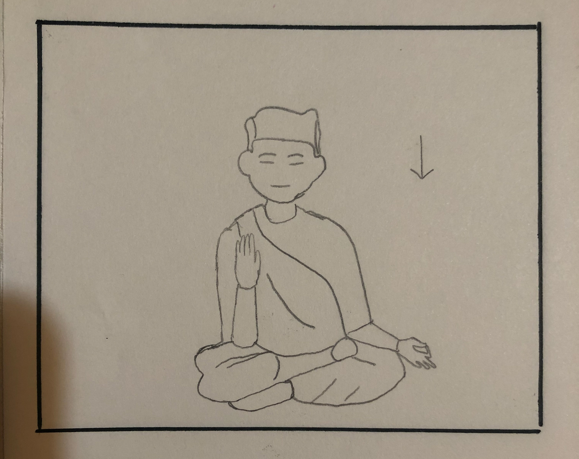
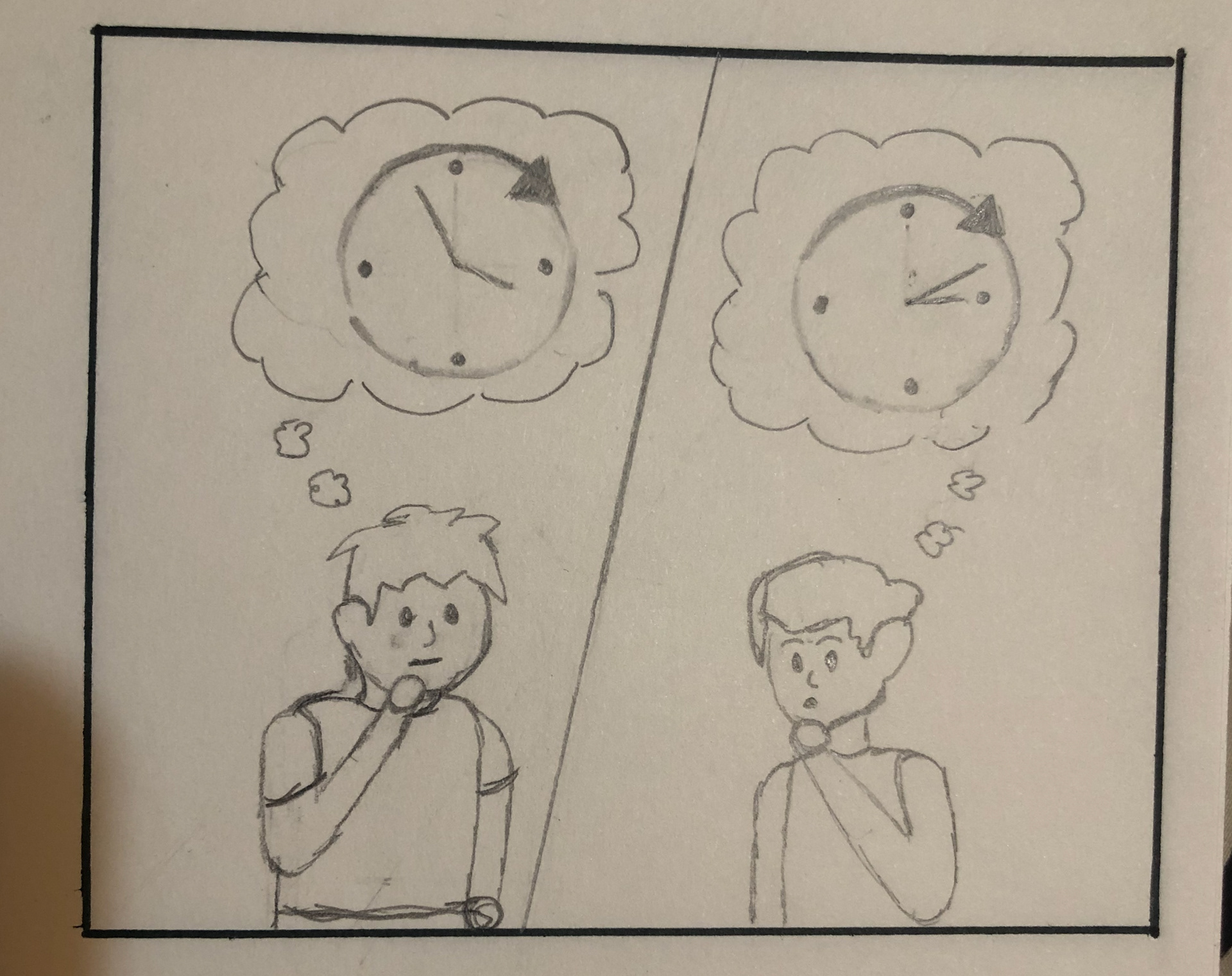
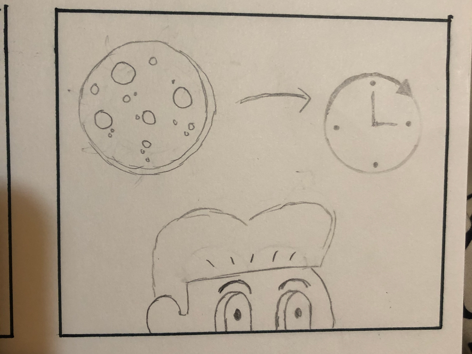
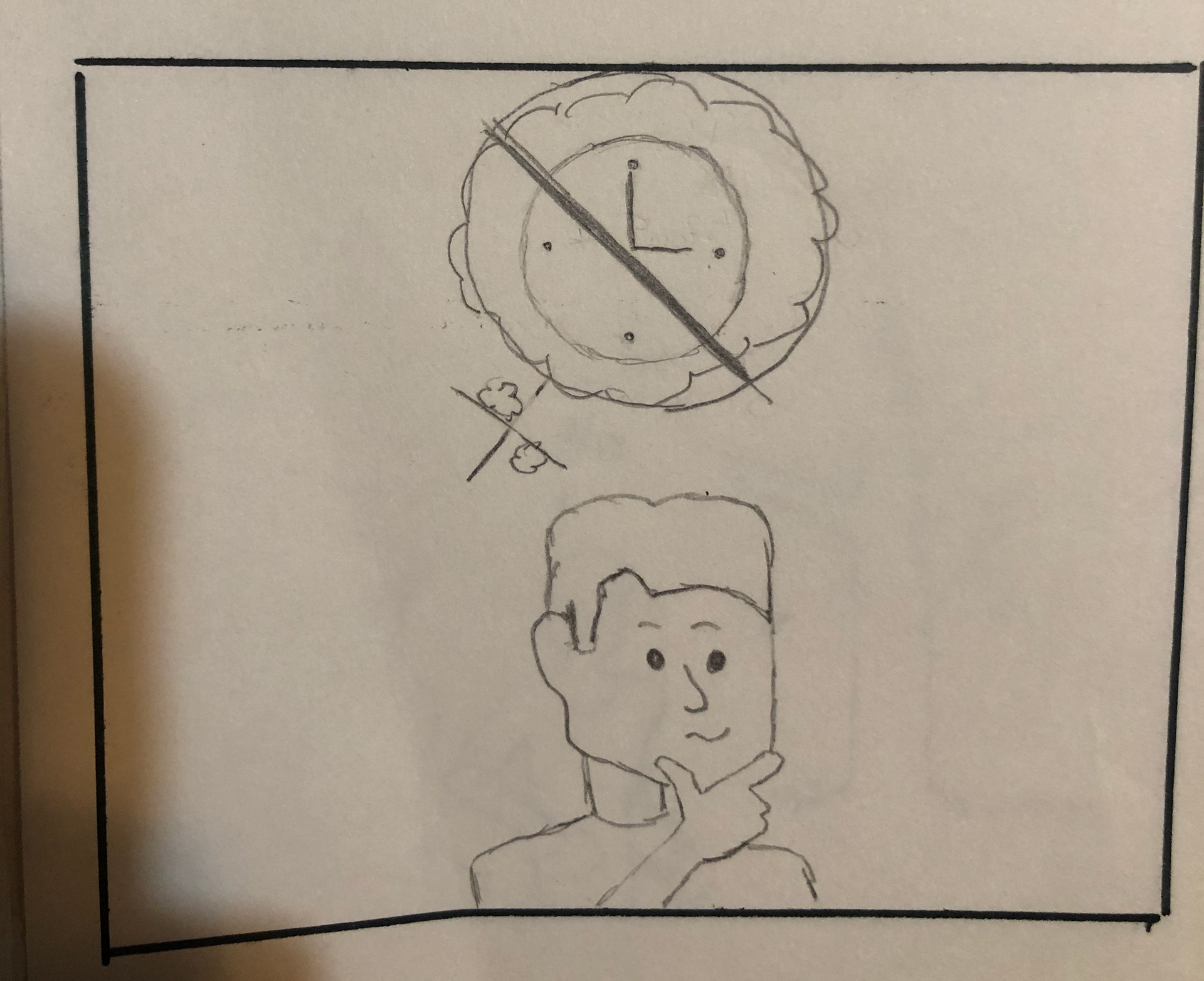
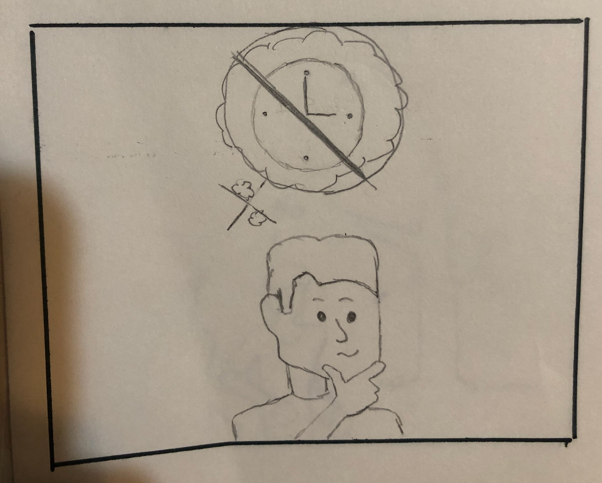
Storyboards


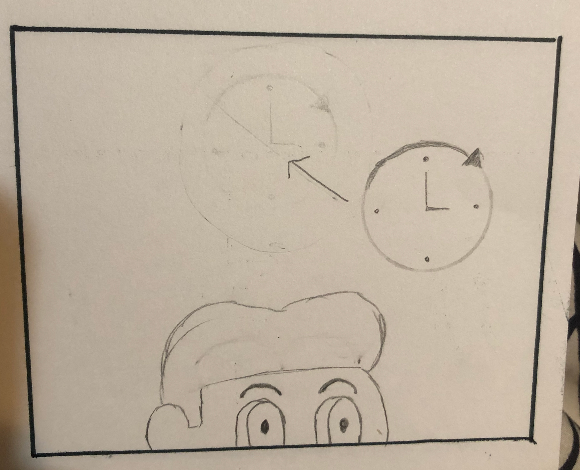
animatic
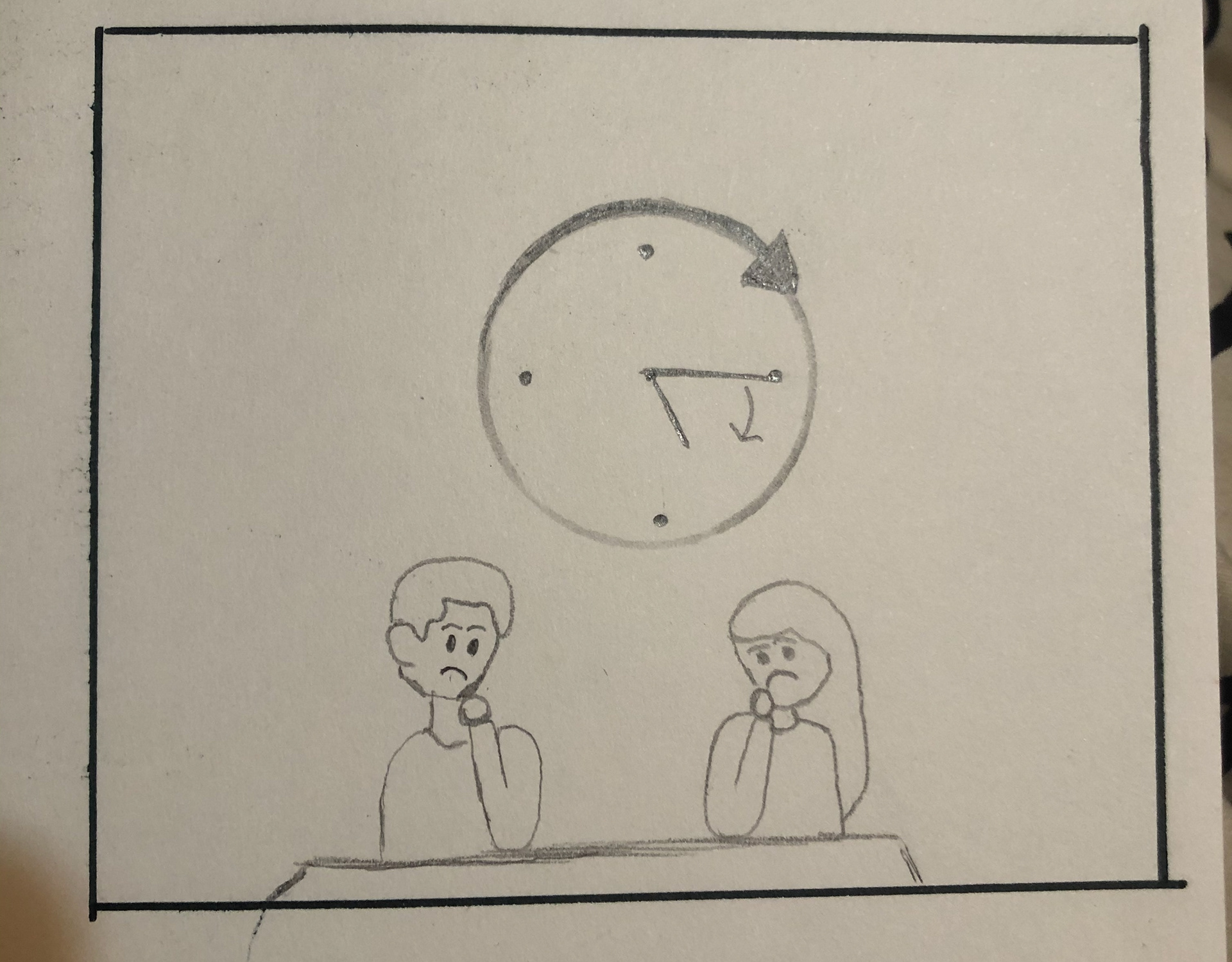
Colored storyboards

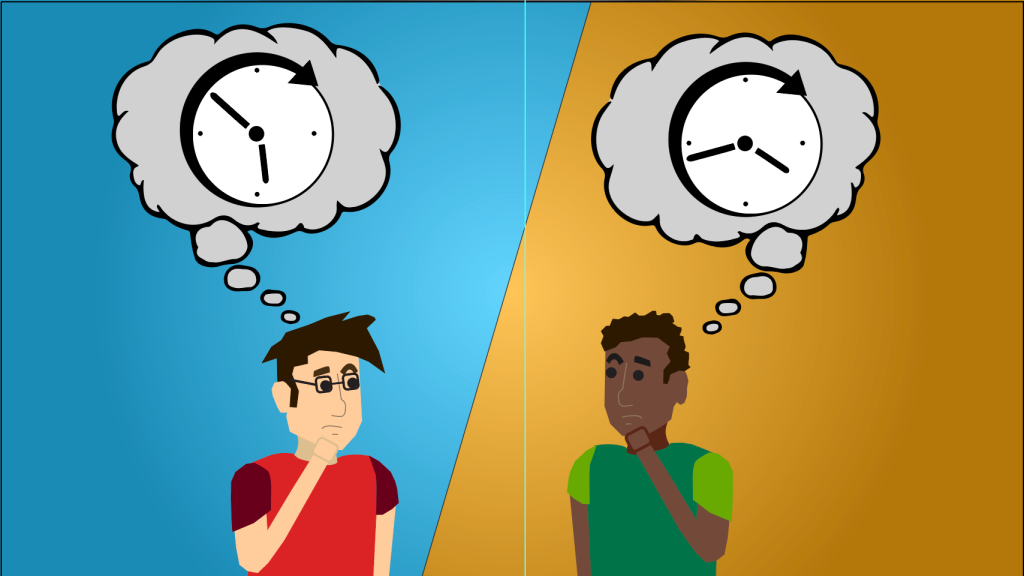
Final Animation