Digital Illustration l Adobe Illustrator l Information Design

Overview
The goal of this project was to redesign the informational designs depicted around the Roddy and Caputo Science buildings of the Millersville University Campus. The two buildings are famous around the Millersville Campus for being impossible to navigate due to confusing or absent signage.
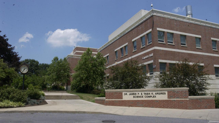
Current front of the science complex (2022)
History
The Science complex is made of two buildings, Roddy Science hall and Caputo Science Hall. Caputo Science Hall opened in the fall of 1999 and is 4 floors. Roddy Science Hall is 2 floors, all finalized after renovation, and completed in the beginning of 2001.
The complex receives approximately 3,000 visitors everyday from students and teachers. Many students visit the building for their classes as it houses many programs such as meteorology, physics, chemistry, computer science, geology and many more. These classrooms are visited by students and teachers who spend hours of every day there, as well as students who are only there once or twice a week for their general education credits.
Analysis
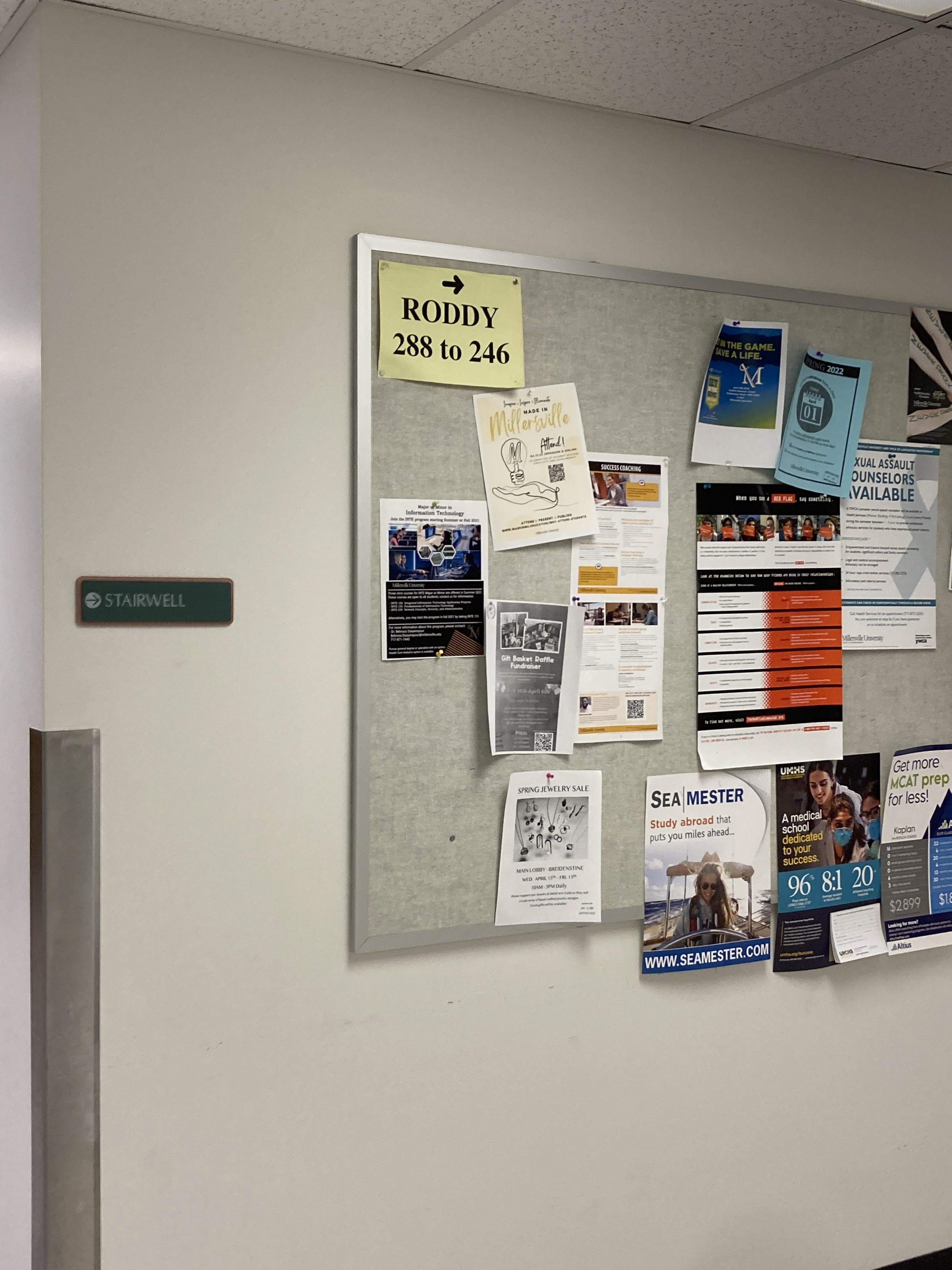
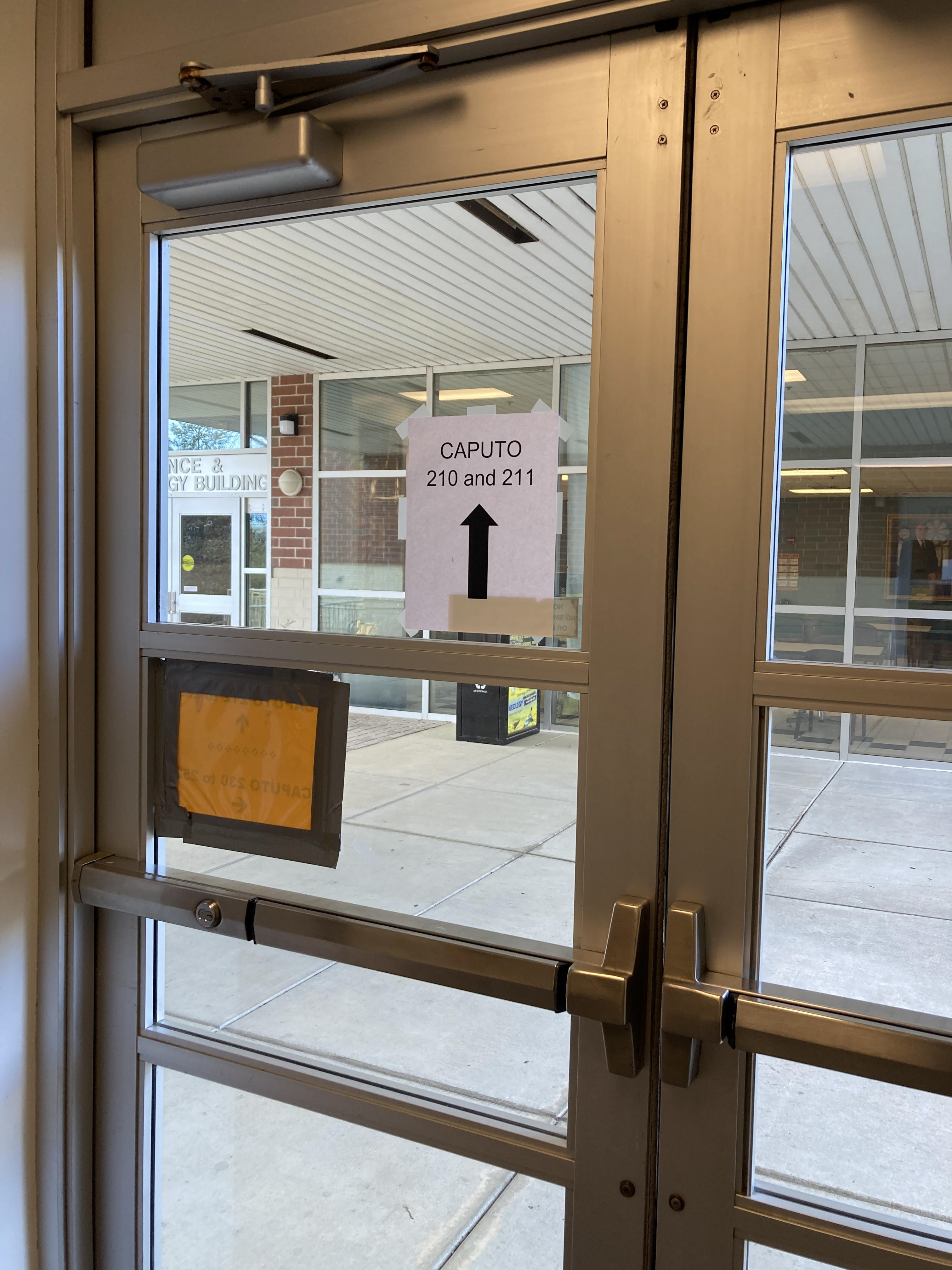
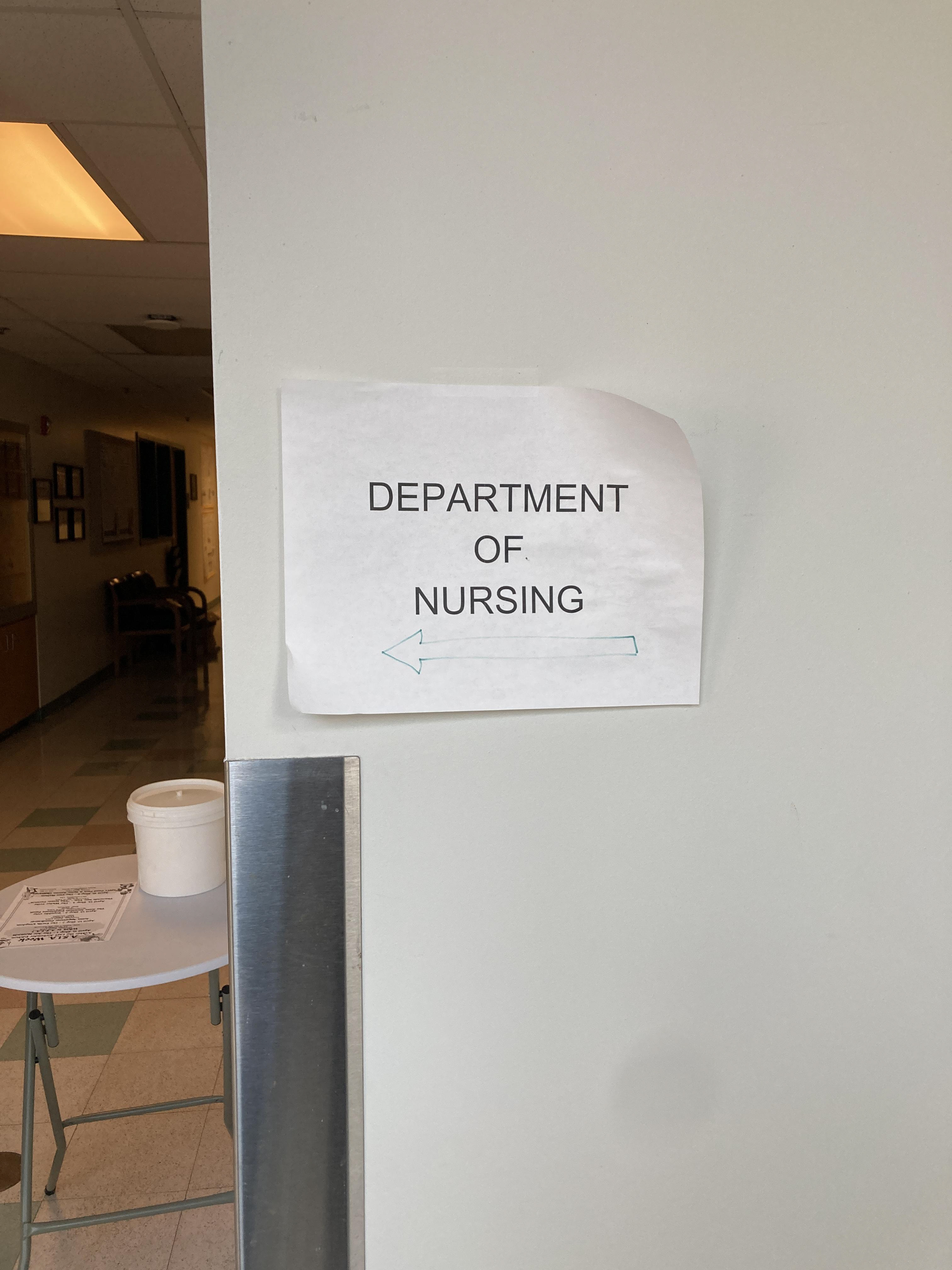
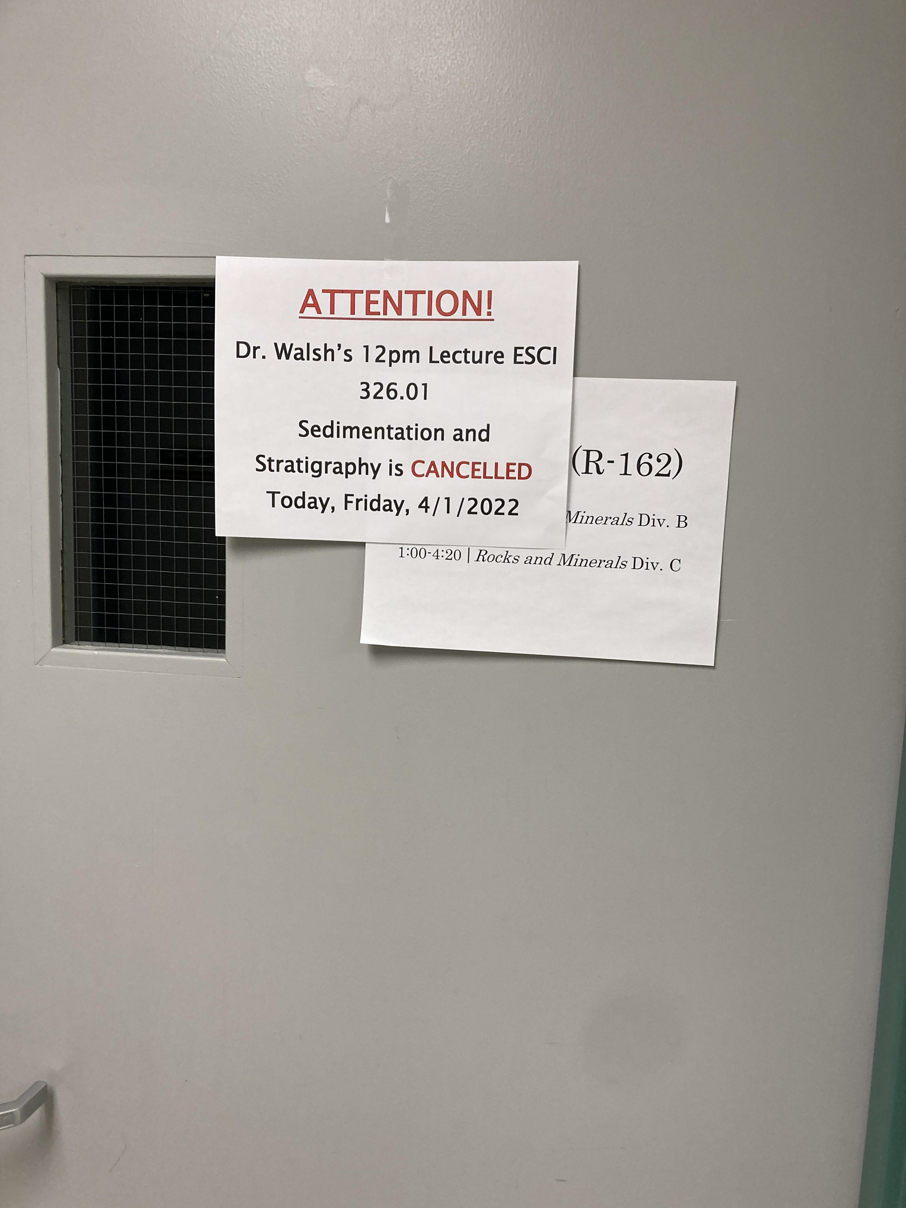
The building can be hard to navigate through especially for students entering the complex for the first time. There is either not enough or too much information to help you navigate the building, or know which building you are in. There is no information to help the average student distinguish between Roddy and Caputo Hall. The separate wings/departments of the building are not labeled with the exception of the computer science department. There are four floors to the science complex. Only two floors are advertised by the main entrance. This is the only entrance that had maps provided. All other entrances had no indications of maps.
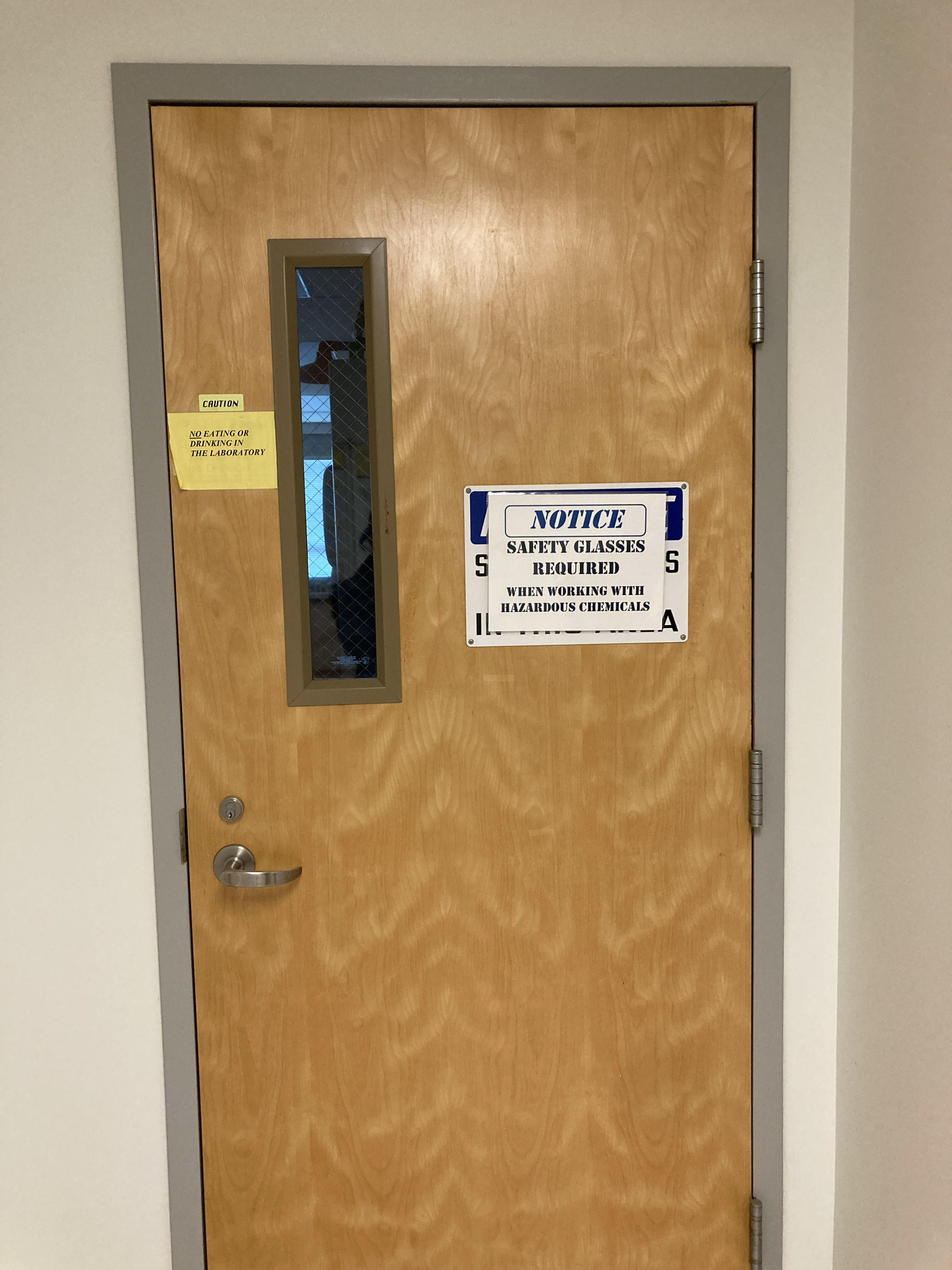
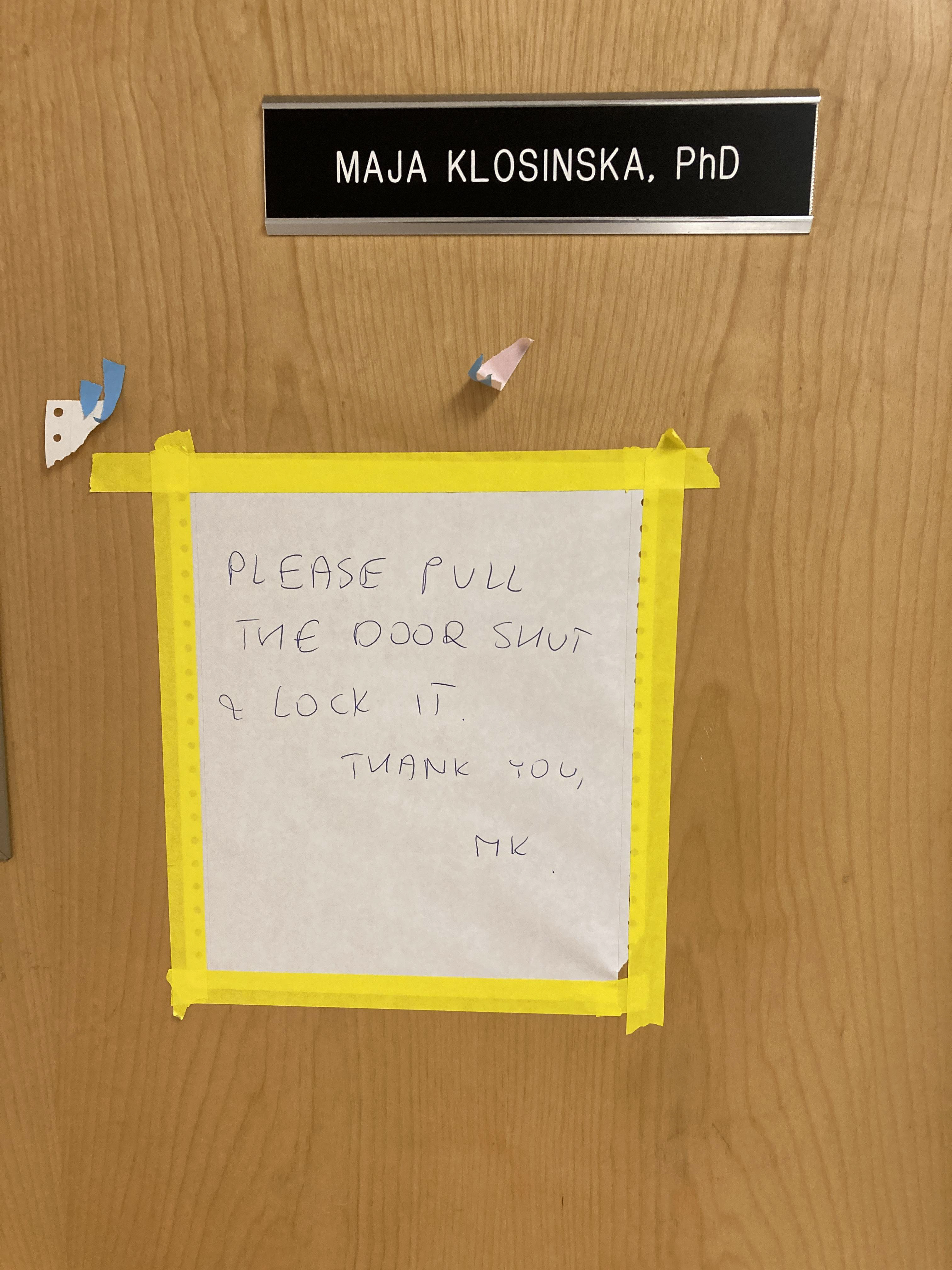
There is an inconsistency in both the design and placement of signs throughout the building. There is also a lot of clustering. This could make it hard for students to find the right rooms or where they need to be. Important information such as Handicap accommodations are placed in areas that are not noticeable. Papers with important information such as class schedules, room reservations, and academic support resources are hung with no indication of importance. Each paper is displayed on an average 8.5” x 11” paper. The average student would not notice this information unless they already knew what the paper looked like.
Design
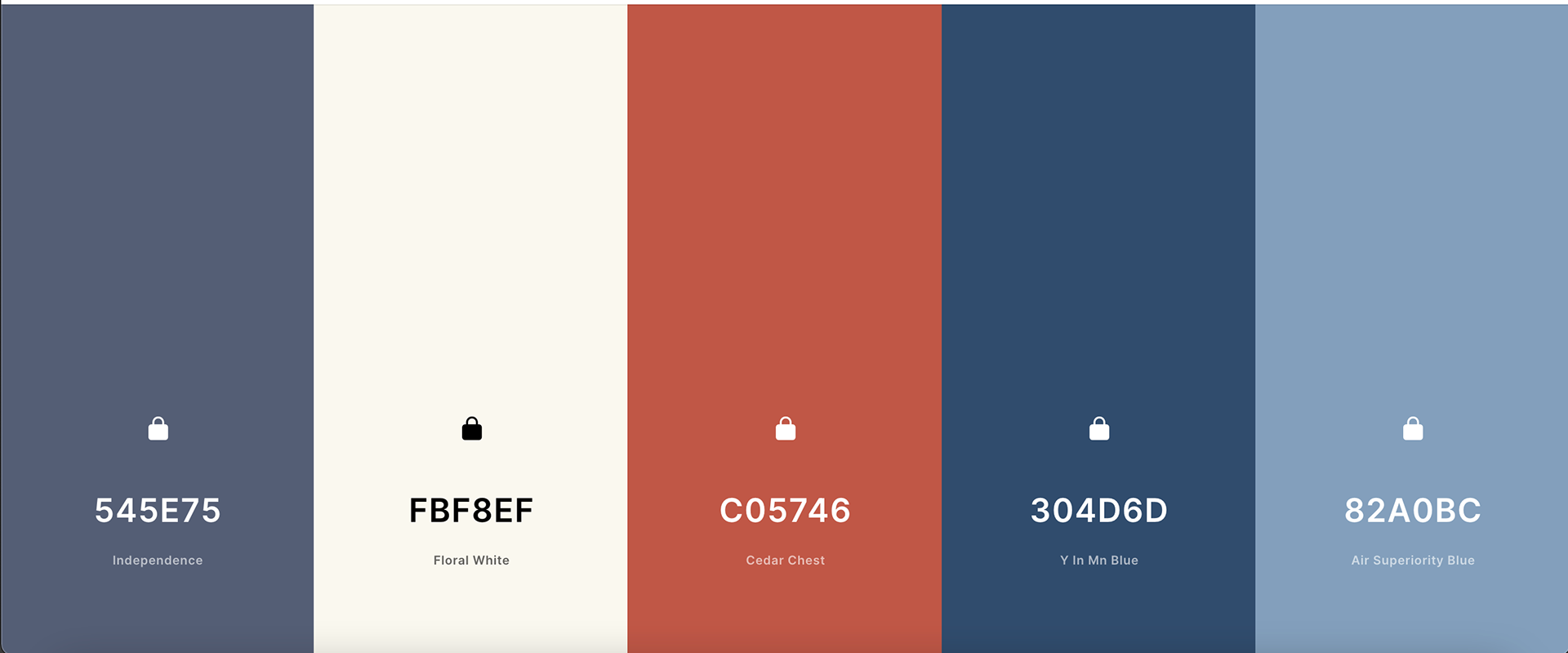
I worked with the minor elements, maps and exterior signs. Here I have depicted the color scheme I created. I went for blue and white as both are considered trustworthy and studious colors. I chose the orange because it's a complimentary color against the blue. Many of the elements in the science complex had issues with noticeability. I figured complimentary colors would be good for grabbing people's attention.

Font
When working on the font, I thought back on how there are readability issues all over the science complex. I chose the sans serif font "Lucida Grande" for the signage of the redesigned buildings.
Ideation
My thoughts when looking to design the minor signage of the science complex, I wanted it to become more sleek and modern. It was obvious the design has not been updated in decades. The san serif font encouraged me to go for a softer style of graphics. Additionally, I went for minimization for the inside signs since a main problem of the building is the over-cluttering.
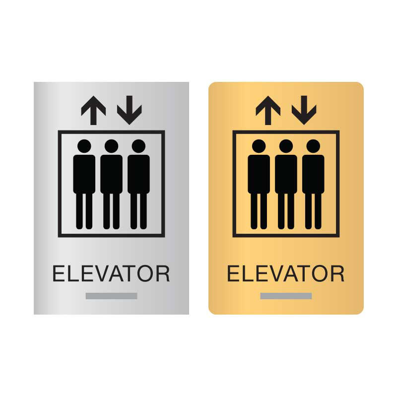
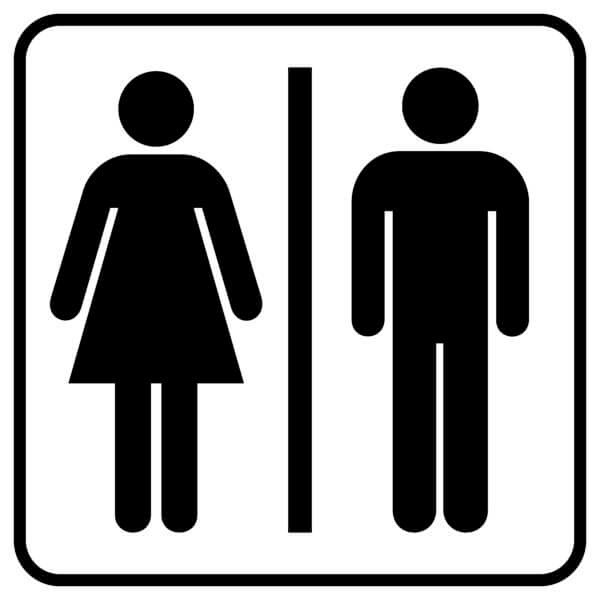


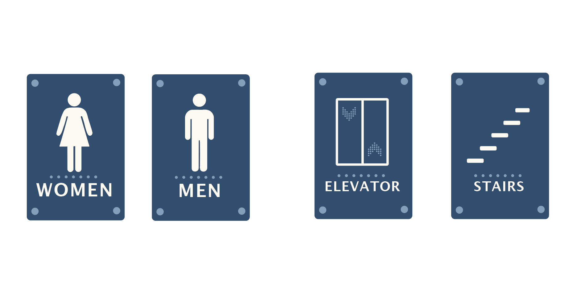
Minor Signage
Depicted are the minor graphics I created for this project. I started with playing around with the arrows, attempting to make them clear and cohesive. After the arrows I proceeded to work on the bathroom signs, elevator signs, and stairway signs.
Final Compilation
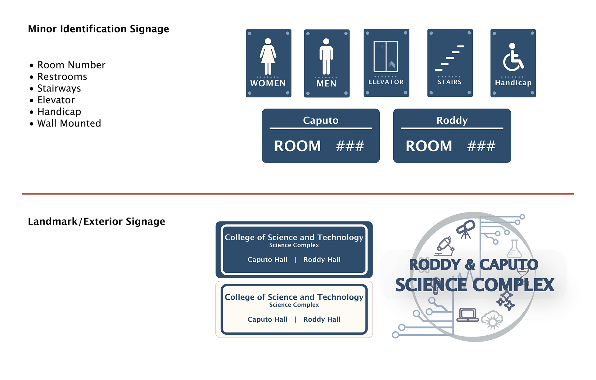
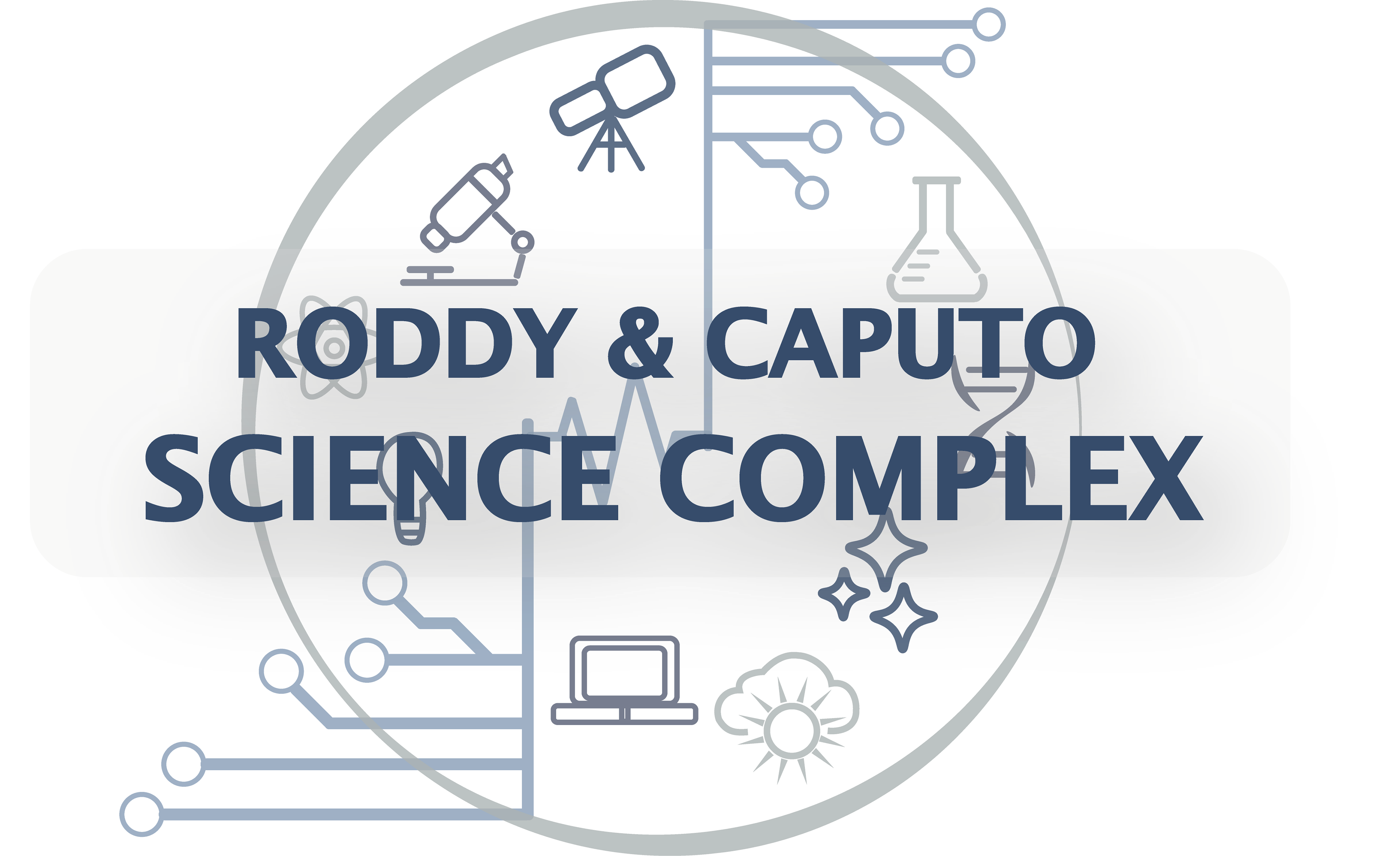
Exterior Signage
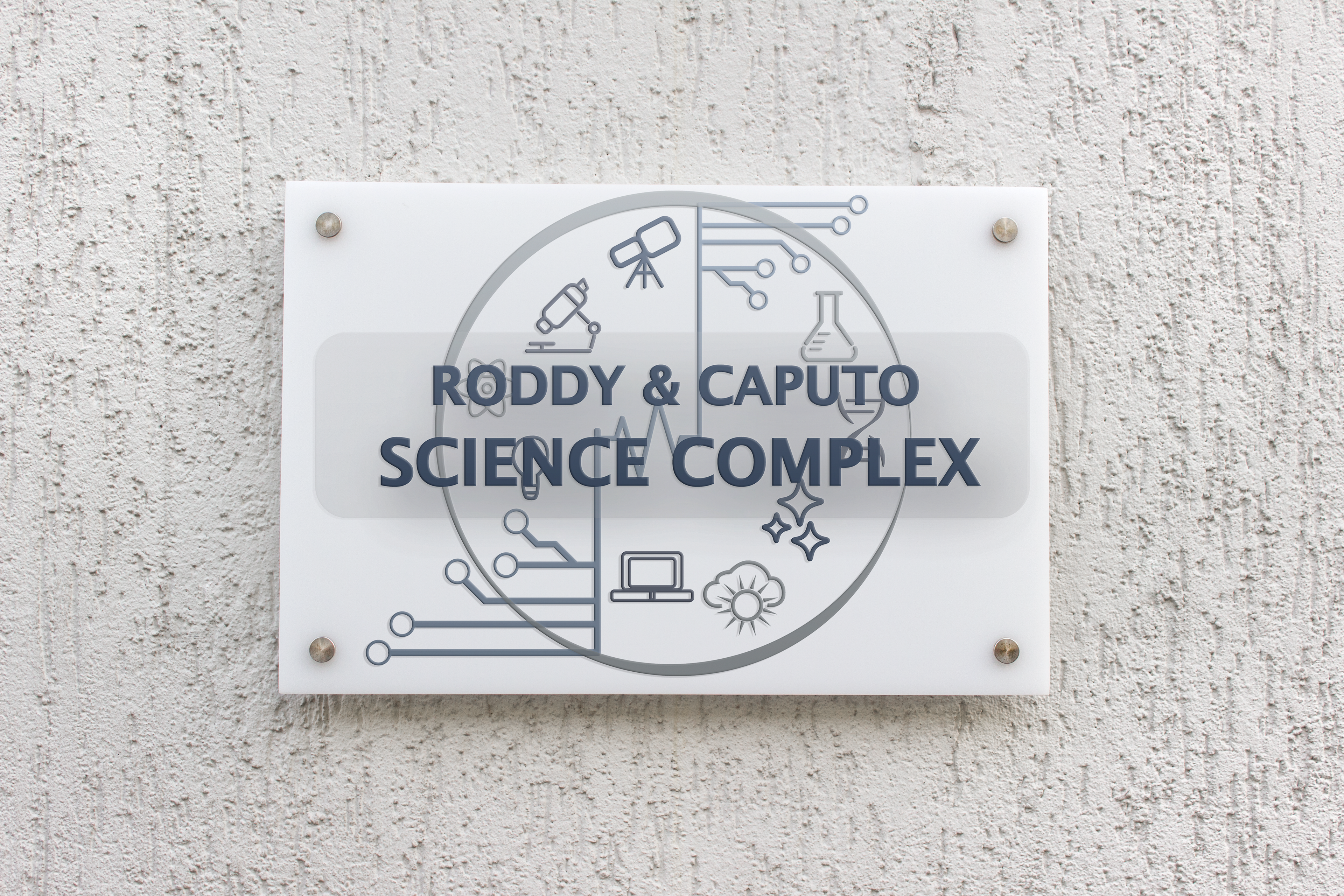
Finally, I went to work on the exterior sign. I started thinking about all the different studies housed in the complex. The science complex is vast with many subjects covered. I then created an element for each. After that, I had to figure out how to organize them. I placed them in a circle, and added circuit board elements to relate back to the technology aspect in the complex. The two circuit pieces are held together with an EKG line to relate to the nursing major. Overtop, the "Roddy and Caputo Science Complex" was added. I added a low opacity rectangle behind the text to represent the frosted glass that would be used in the final sign.
Exterior Signage Mockup