Digital Illustration l Adobe Illustrator and Adobe Photoshop l 2D Foundations
Overview
The goal of this project was to design a repeating pattern, and then create a physical product relating to said pattern. Create a product that you would see this design on.
Intro
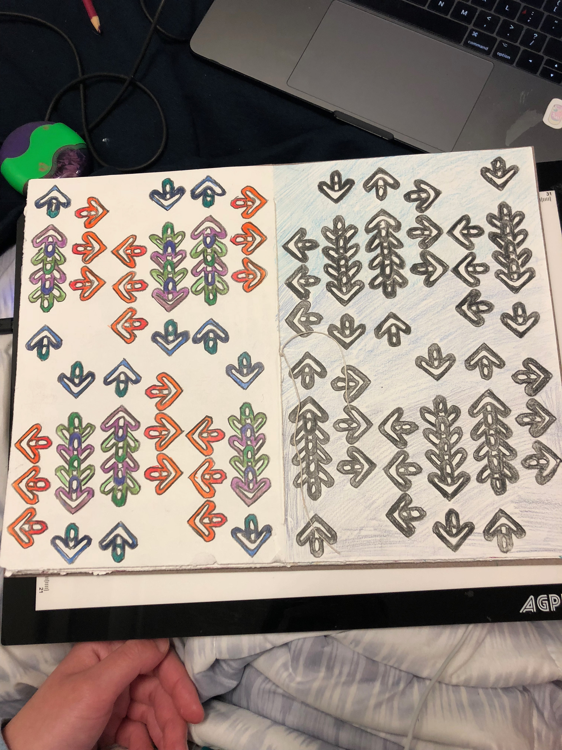
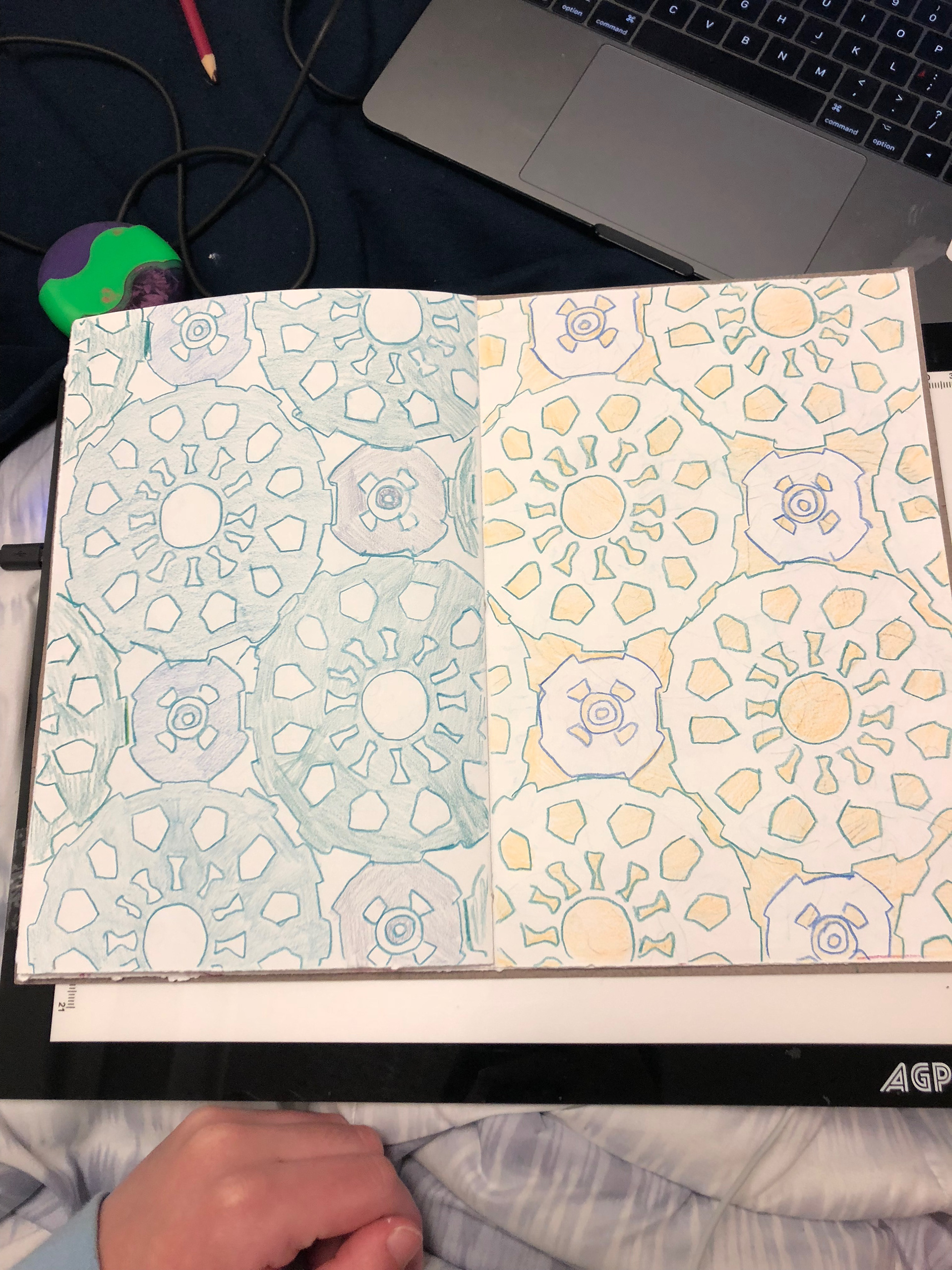
I started this project by sketching and brainstorming different ways to create a repeating pattern. A repeating pattern can be one of four types: full drop, half drop, mirror, or continuous. I experimented to find my favorite method and tried out different color schemes for both.
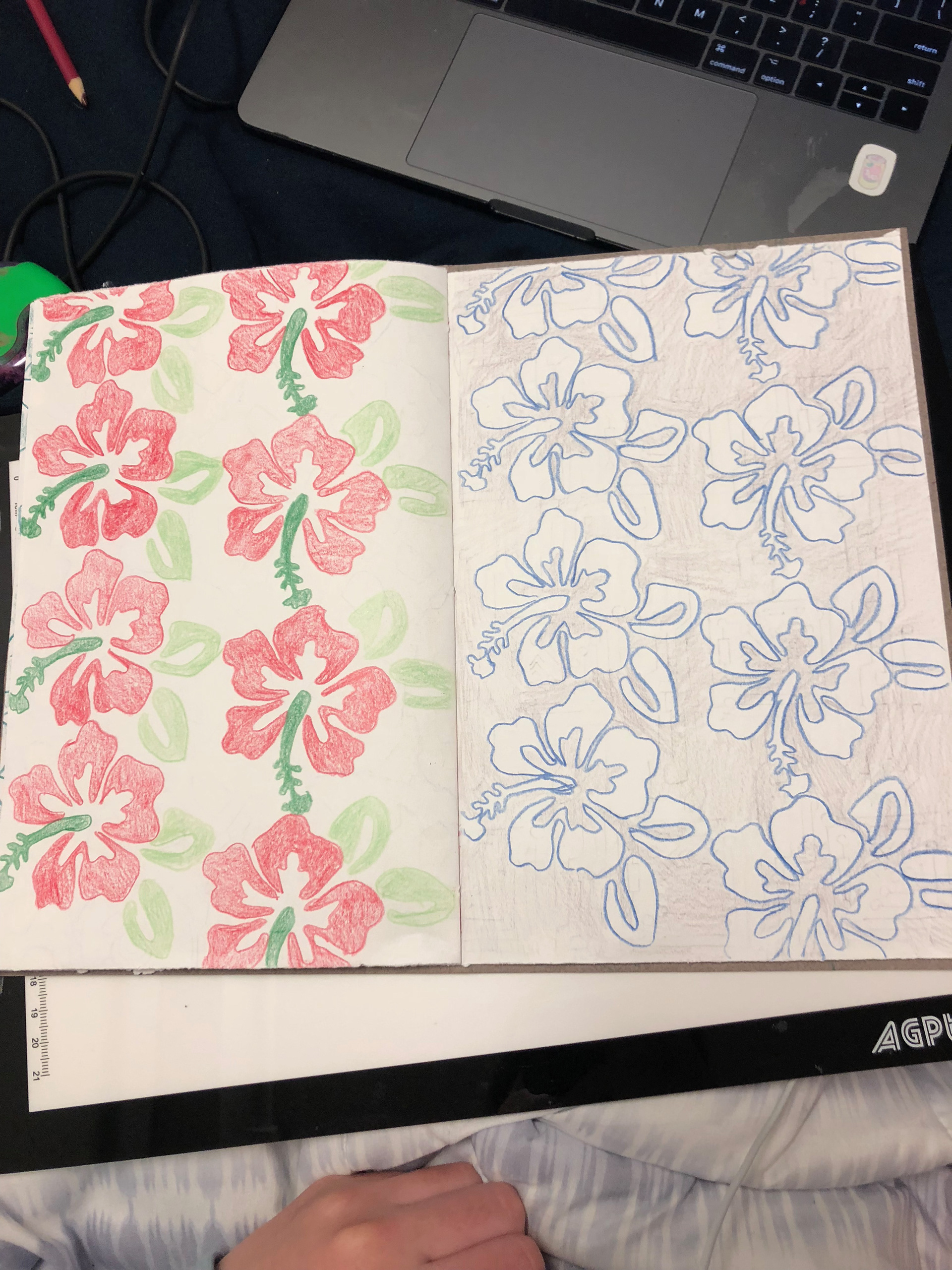
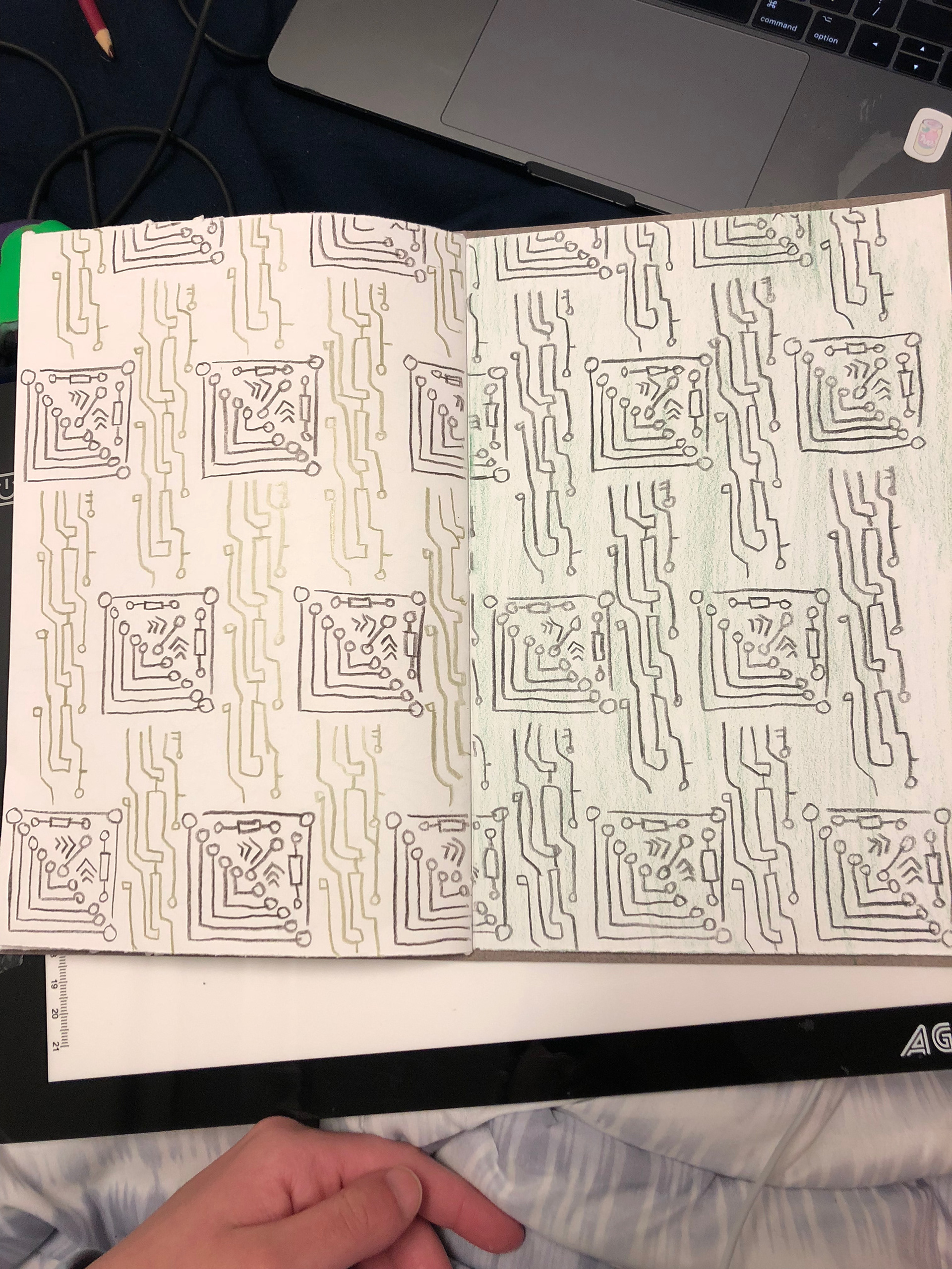

Brainstorming & Sketches
After deciding that I wanted to create a continuous repeating pattern, I settled on a video game theme, drawing inspiration from my early sketches, especially the one inspired by the game "Dance, Dance, Revolution".
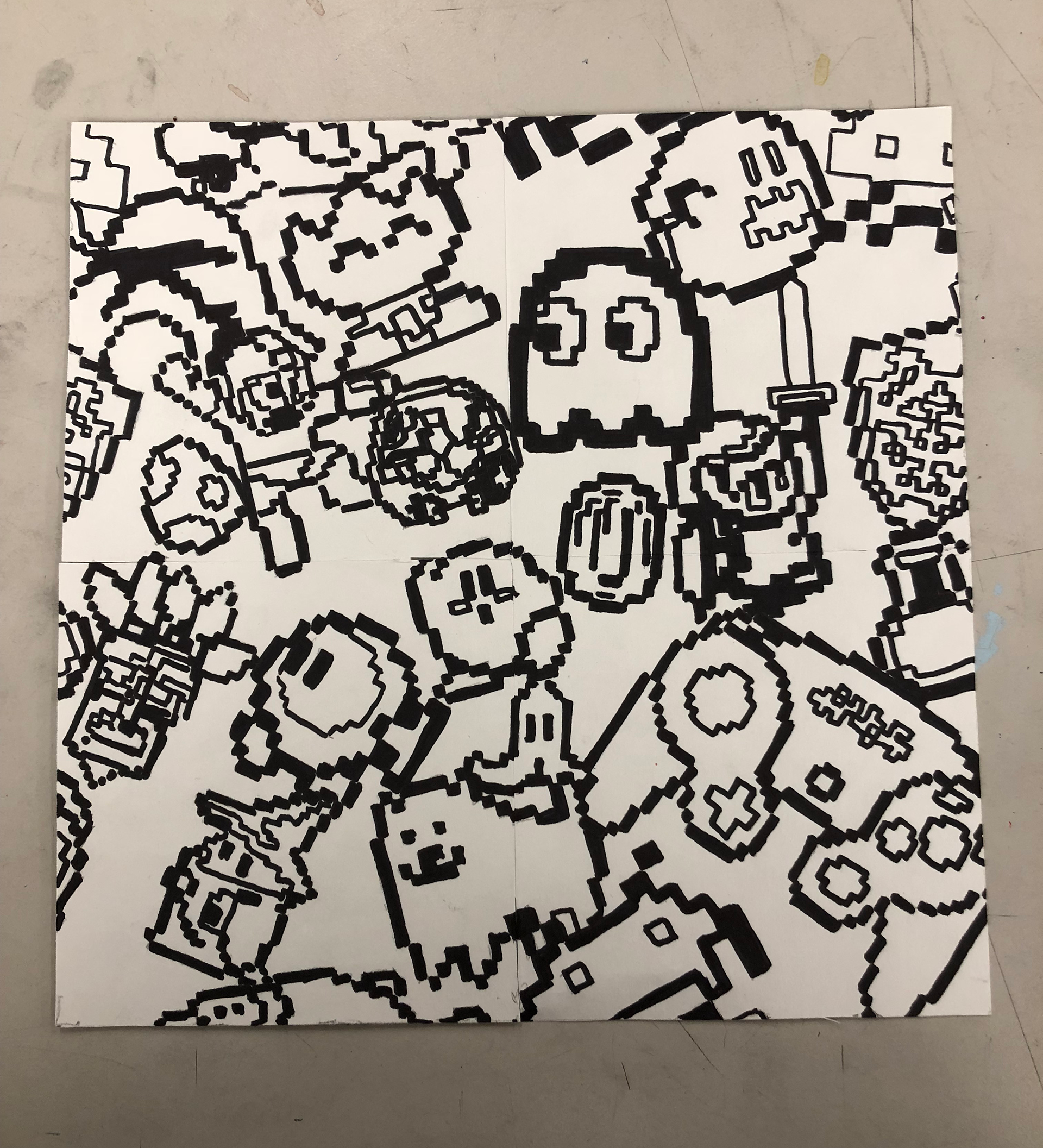
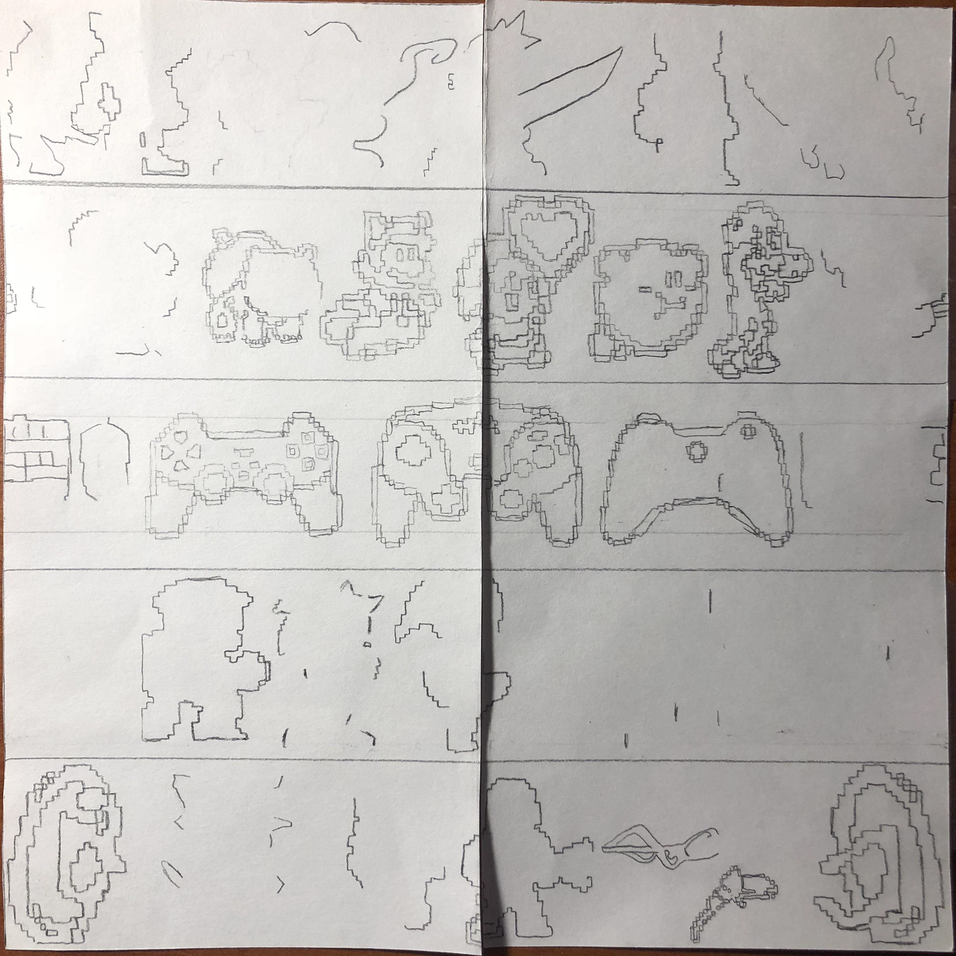
I went for characters that are typically seen in a pixel or 8-bit/16-bit style. I used the Game Cube controller as it screams traditional gaming to me. To start, I sketched the first panel by hand. To create the repeating pattern I used a method learned in 2D Foundations. I drew a majority of my design, avoiding the edges. Then, I cut the square in half vertically, and tapped the sections back together so that the blank edges touch. Then, I filled in my design in that section. After that, I cut the block in half horizontally and repeated the same process.
Once completed, I took the design into Illustrator. When creating the poster, I printed out 12 of the panel and put them together to create the repeating pattern. I colored in the bottom right square to show what I was thinking for the color scheme. After receiving feedback on my poster, I took my design into Illustrator. I added the colors and put all the panels together digitally.
Final Version: Beginning Panel
After the first repeating pattern exercise, I was given the task of creating a design related to my previous design. The theme was to stay roughly the same, but I was tasked to consider what this design would be printed on.
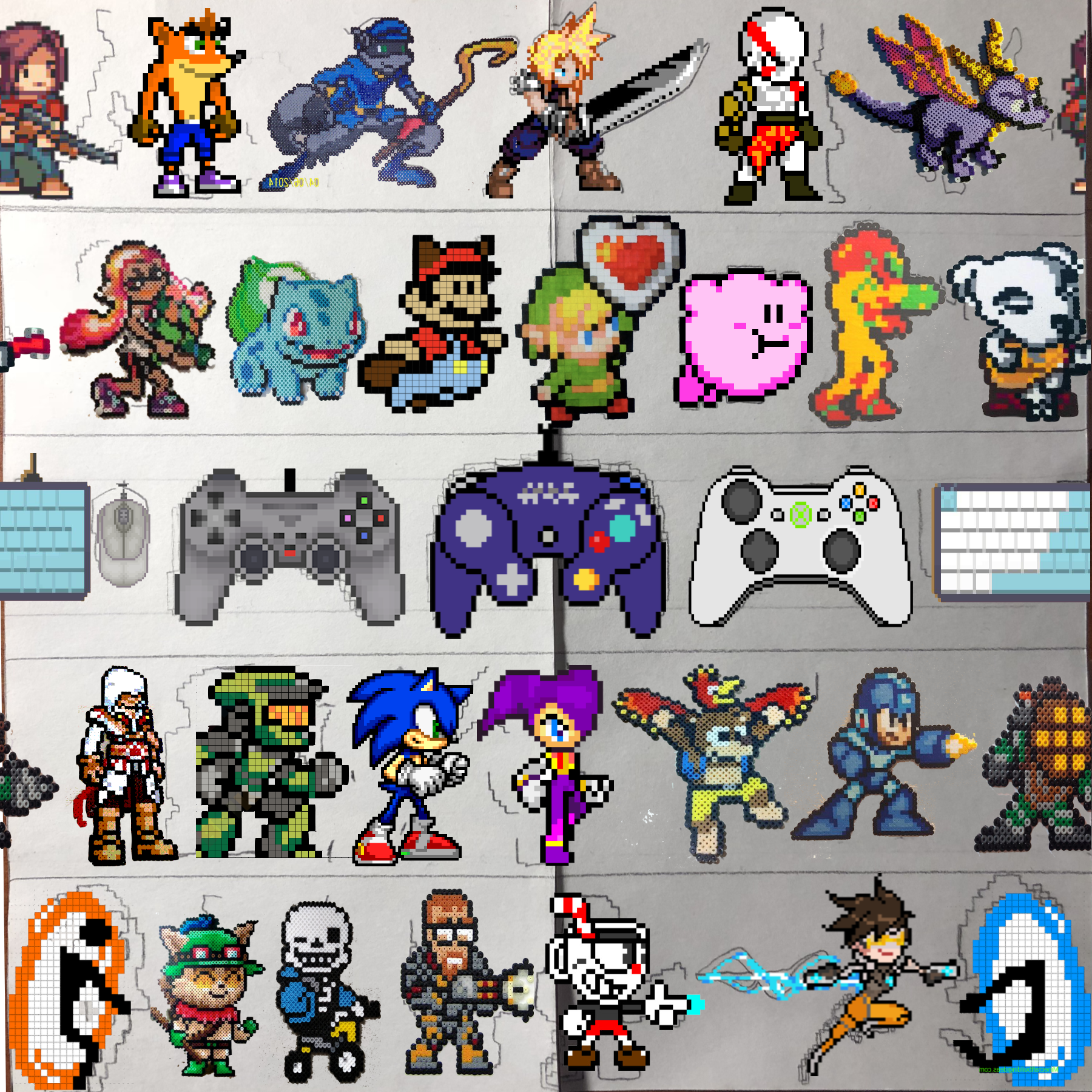
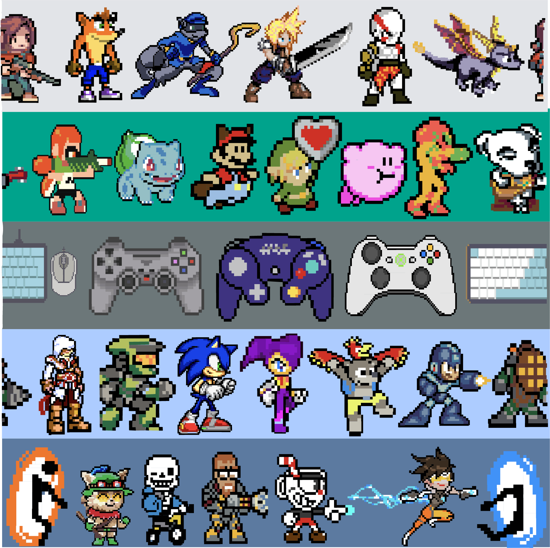
For my pattern I went for a continuous pattern horizontally, and a full drop pattern vertically. I created rows of characters that would stack on top of each other. To sort them, I decided to segregate the characters by console they were distributed on. I started on top with video game characters typically seen on the Playstation. Following that, I have characters that are associated with Nintendo. I put a series of controllers in the middle row to add to my theming of different console designs. Below the controller like I have characters typically seen on Sega/X-Box systems. Finally, on the bottom I used characters associated with PC gaming.
I repeated the same pattern making method as the previous exercise. I then took my cut up panel and took it into Illustrator, applying clear lines and colors. I added background colors to the characters, after creating a cohesive background color scheme.
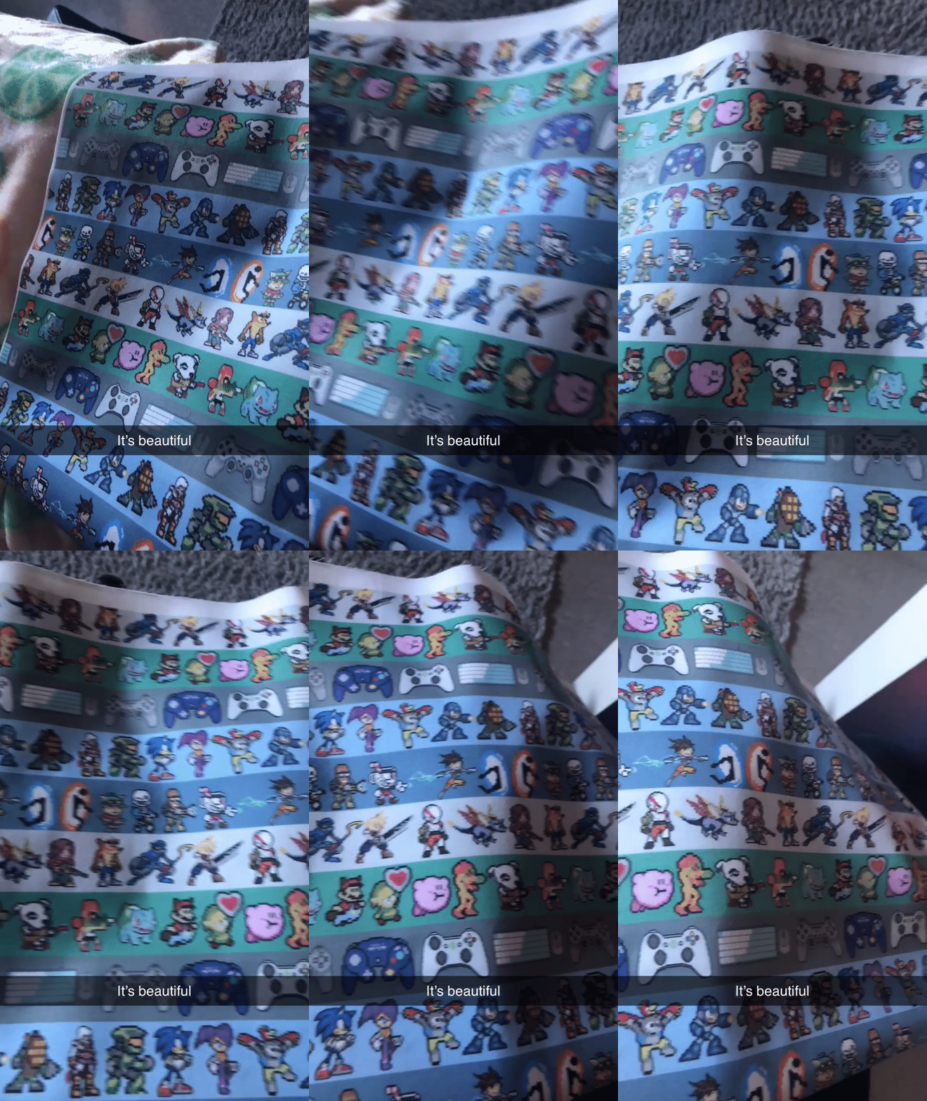
Final Design & Product Design
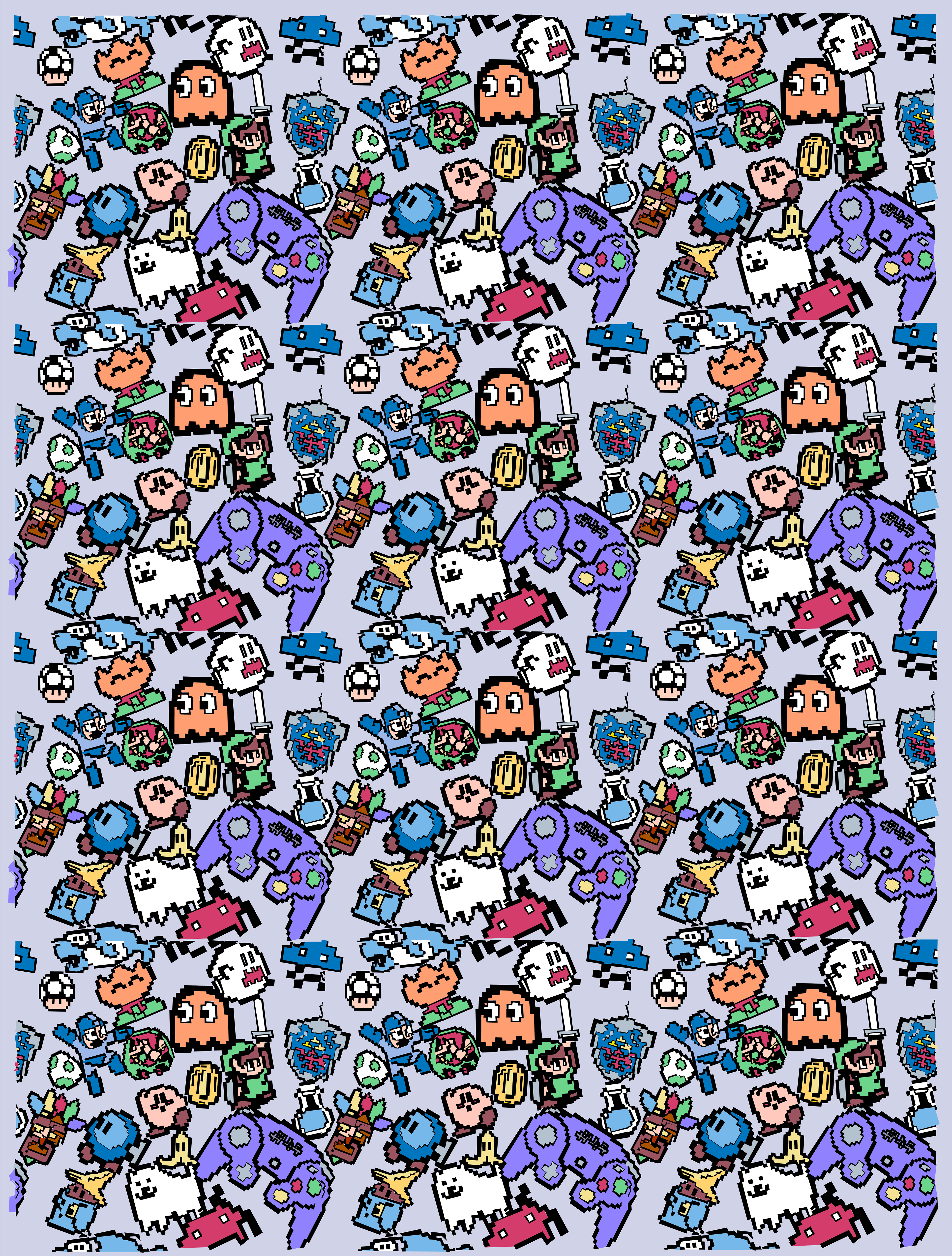
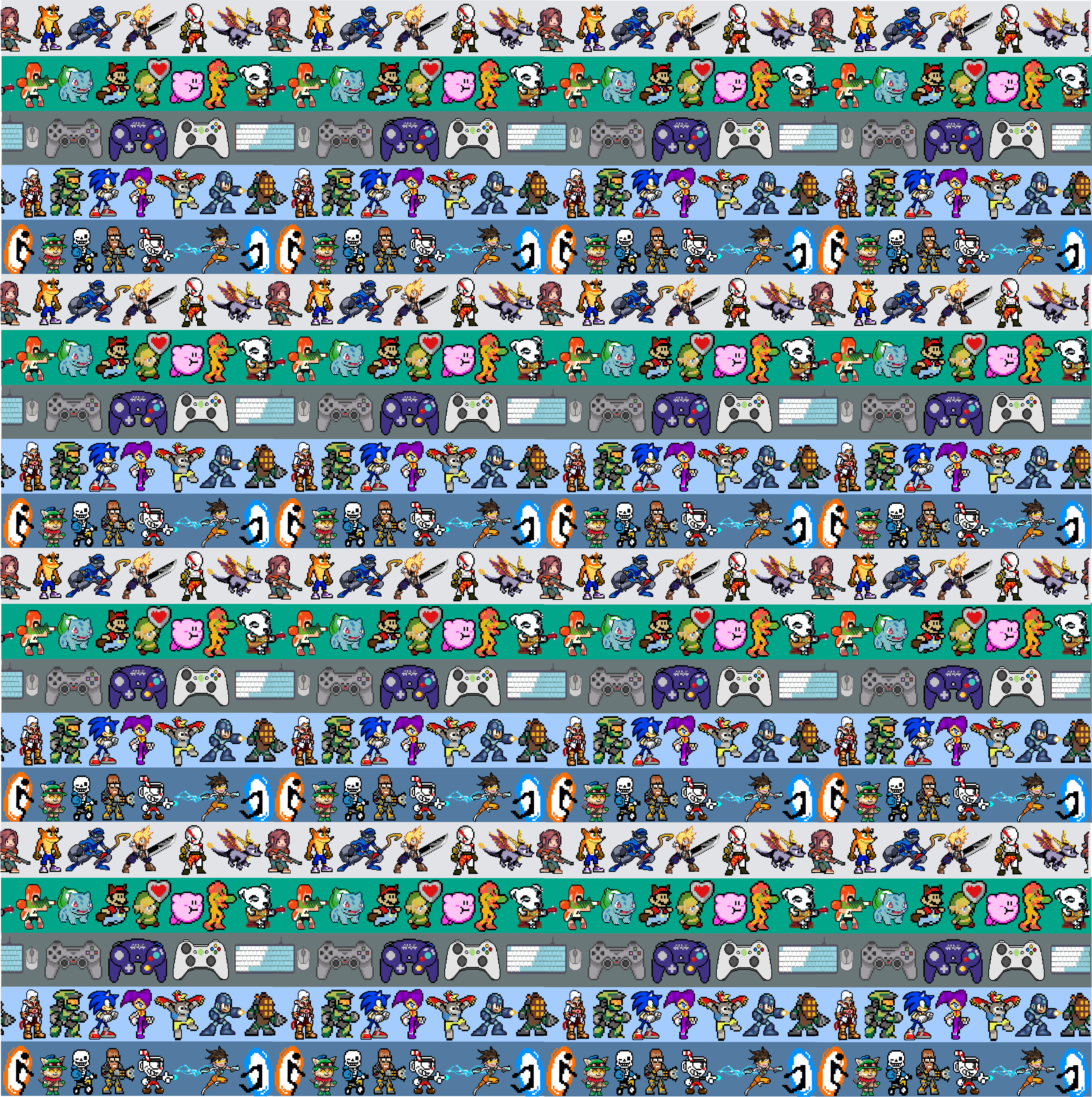
After creating my repeating block, I took the block into Illustrator. I repeated the block multiple times, and created the design on the left. Once created, I thought about where I would see a video game print and what would be useful and practical to create with the resources I had available. I thought about how gaming has become more portable and accessible. I could even game on my art computer with how mainstream online gaming has become. Through this thinking, I settled on creating a laptop case and matching mousepad. Computer or PC gamers strictly use an external mouse for its response time. This thinking lead to me adding the mousepad.
I printed my design onto linen and found a pattern online for Macbook cases. Using my sewing knowledge, I created the laptop case with a double sided zipper and alternate fabric inside. Batting was placed in between the two layers to provide cushioning. I created the mousepad out of fabric, cardboard, film sealant and felt. The felt was for the bottom to create the soft texture often seen on the bottom of mousepads. The film sealant provided the smooth surface the mouse needs to glide across.
Final Design
Mockups
In addition to my physical product creation, I considered where else this design might appear. The bright character style gave me the vibe of children's wrapping paper. Not only does the product typically include bright and recognizable characters, but it must have a repeating pattern, making it a perfect product for this design.
